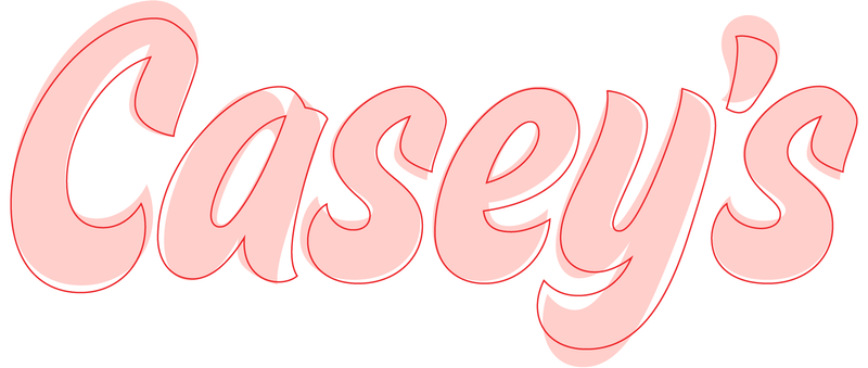
“This whole project started because of an apostrophe” is not a line you hear often, but in the case of the rebranding of Casey’s convenience stores, that’s where our involvement with Interbrand’s award-winning identity began.
Interbrand had already licensed a solid typeface for their major reboot of the Casey’s identity: House Movements Sign, designed by our good friend Ken Barber at House Industries. But the overbearing apostrophe and a few of the letterforms were not working for the design team. They hired Jesse Ragan to apply his expertise to closely refine the lettering, optimize it for use at a wide range of sizes, and yes, rethink that pesky apostrophe.
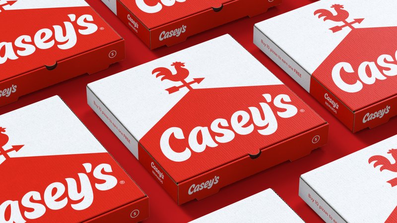
Interbrand also asked Jesse to redraw the weather vane illustration based on their sketch. Treating that image like a letterform and treating the letterforms like an image, he brought the two elements into alignment and gave it a final polish.
Redrawing both the rooster and the letterforms in the same style was admittedly a strange—but fun—challenge. Jesse found ways to nestle specific letter combinations together comfortably and adjusted the tail feathers to match the C and S. He also tweaked the rooster’s chest to look “prouder,” reworked the beak to look more prominent, and made every detail more clearly defined.
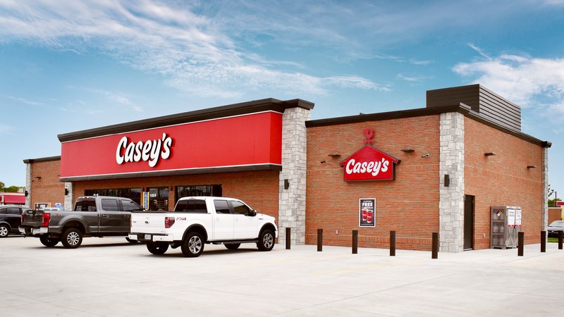
Because the logo was going to be used both very large (building signs) and very small (digital screens), many tiny adjustments were required to make the entire lockup both legible and iconic.
Often, when a design agency comes to us with a “final” logo their client has approved, we step in with micro-adjustments that may be hard to spot at first. But if you’re going to fabricate enormous signage for more than 2,000 locations—not to mention innumerable pizza boxes—it’s worth going the extra mile.