Our work with Dartmouth College is a story of serendipity combined with a long-standing interest in the lettering work of eminent type designer Rudolph Ruzicka. This collaboration resulted in a logotype and custom typeface steeped in Dartmouth’s history, which set the tone for their new identity system.
Custom typeface and lettering for Dartmouth College
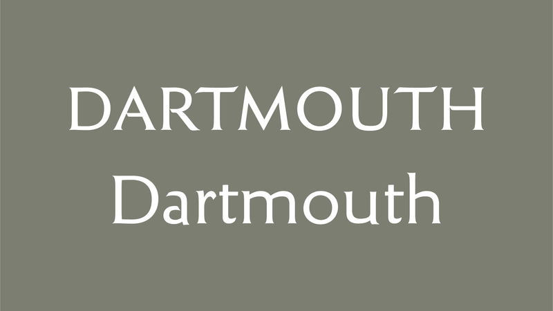
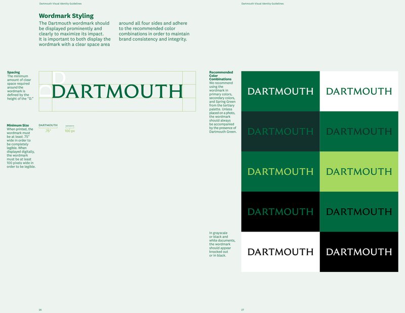
Dartmouth logotype
The right person for the job
When Bobby Martin and Jennifer Kinon of Champions Design brought Jesse in to help advise on typography for Dartmouth in 2017, little did they know that they were asking the exact right person at the right time.
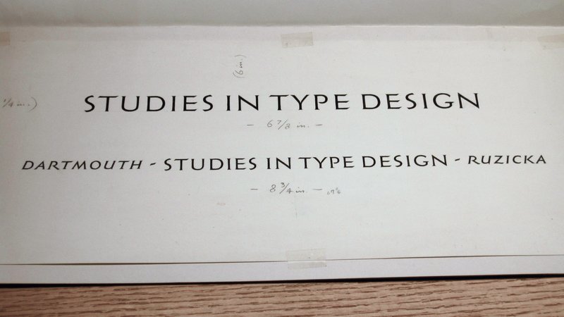
Back in 2000, when Jesse was an undergraduate at the Rhode Island School of Design, he came across the book Studies in Type Design, a portfolio of alphabets by Rudolph Ruzicka—typefaces that were never fully realized. Jesse became captivated by this collection that had been published in 1968 when Ruzicka was eighty years old.
Over the course of several years, as a personal project, Jesse experimented with reinterpreting these alphabets as full typefaces. His thorough research even led him to travel to an institution beloved by Ruzicka, which published his Studies and holds an extensive archive of his papers and works: Dartmouth College.
Forward thinking but rooted in the past
The day Jesse visited the Champions Design office, he had no idea who their client was or that his personal project would come to life in such an unexpected way.
There wasn’t much doubt in the moment that this was the right path.
Jesse Ragan, XYZ Type
Champions had already met with Dartmouth and knew that their updated identity for the university would focus on five keywords that make the university unique: open-minded, intellectual, pioneering, nurturing, and rooted. They told Jesse: “We need a typeface that is forward-thinking but historical.” He was more than happy to help them do just that.
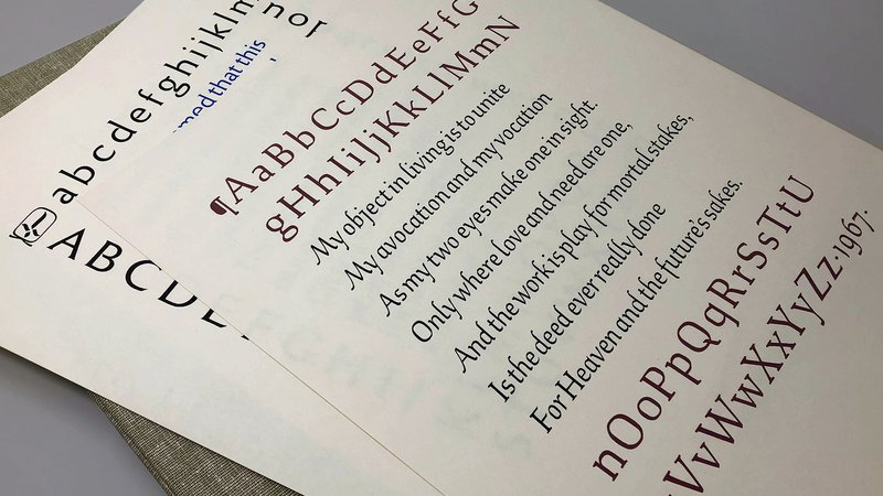
Plates 1 and 10, Studies in Type Design
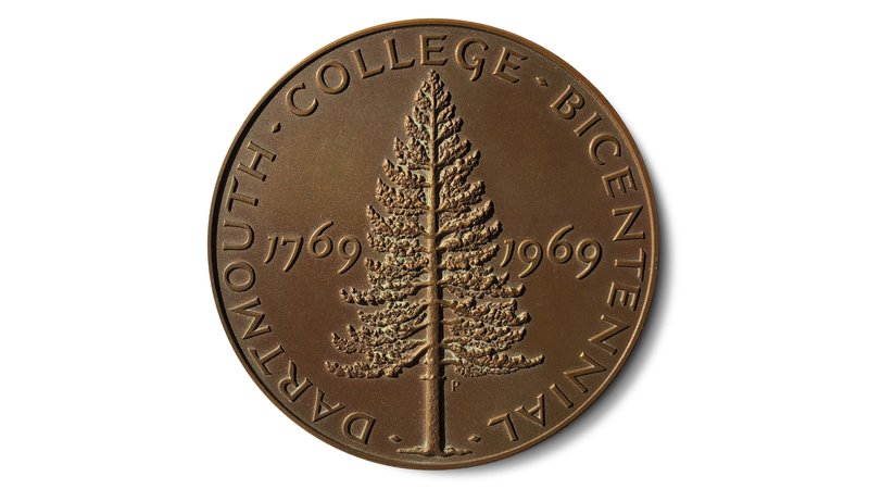
Dartmouth Bicentennial Medal
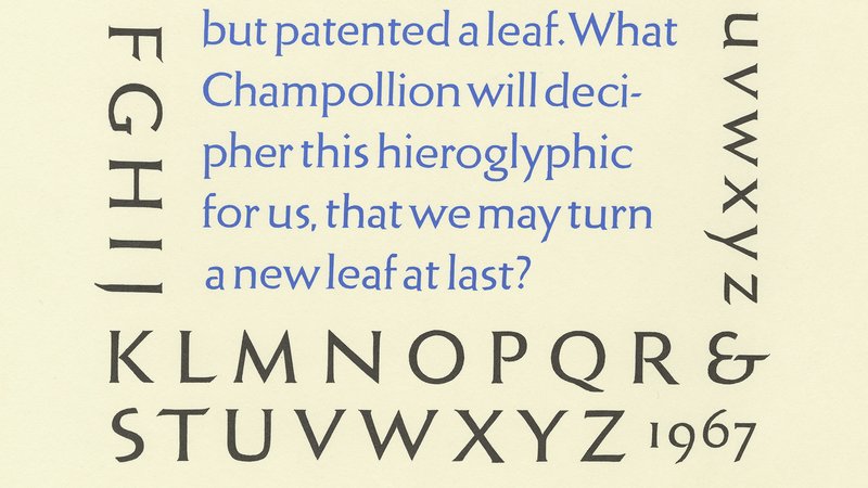
Plate 10, Studies in Type Design
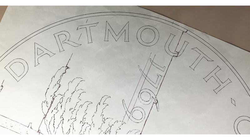
Ruzicka’s original renderings for the Dartmouth Bicentennial Medal
Ruzicka’s original painted artwork for Studies in Type Design
Getting the logotype right
Together with Bobby and Jennifer, Jesse took a close look at the Ruzicka alphabets he had previously digitized to choose the best one for the Dartmouth logotype. After experimenting with several different options, they settled on a stately set of flared serif capitals Ruzicka had used in his design for the 1969 commemorative Dartmouth College Bicentennial Medal. These letterforms, which set just the right tone for the identity, were also among Jesse’s favorites presented in Studies.
Jesse returned to Rauner Special Collections Library at Dartmouth to dig further into Ruzicka’s papers and drawings. Inside, he found amazing artifacts of the designer’s process, including the original drawings for the medal, the hand-painted alphabets for the book, and an entire box of metal letters used to cast a Bicentennial Plaque on campus.
Handling Ruzicka’s original drawings made me feel personally connected to him. I was able to get into his head a little bit to see how he was thinking.
Jesse Ragan, XYZ Type
Our collaborative process with Champions included several rounds back and forth, starting with broad exploration and then zeroing in on small refinements attuned to the visual language of the overall identity system.
By adding and subtracting weight, making serifs thicker and more pronounced (or removing them altogether), and deciding between upper and lower case, the team landed on a logotype that balances the historical roots of Dartmouth while still feeling modern and forward-looking.
Jesse’s logotype exploration based on Ruzicka’s lettering
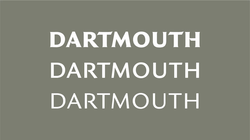
Jesse’s logotype exploration based on Ruzicka’s lettering
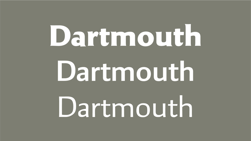
Jesse’s logotype exploration based on Ruzicka’s lettering
Final Dartmouth logotype
A custom typeface just for Dartmouth
In addition to the lettering style used in the logotype, Bobby and Jennifer were drawn to a text serif typeface from Studies in Type Design, which captured the history and academic focus that Dartmouth wanted to bring to all of their communications. They commissioned development of the typeface into a full family, prompting Jesse to pick up a project that had languished in search of a purpose.
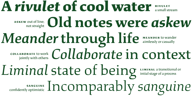
The proprietary typeface, Dartmouth Ruzicka, includes special characters and flourishes that help everything from brochures to the university’s website feel distinctively “Dartmouth.”
Study
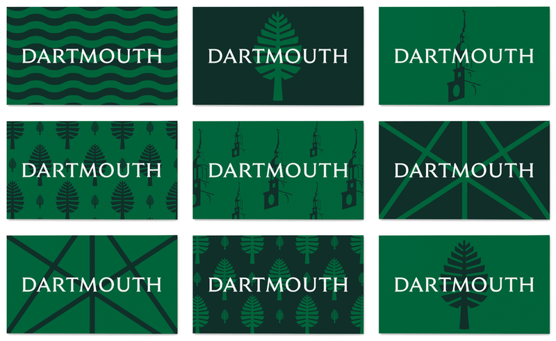
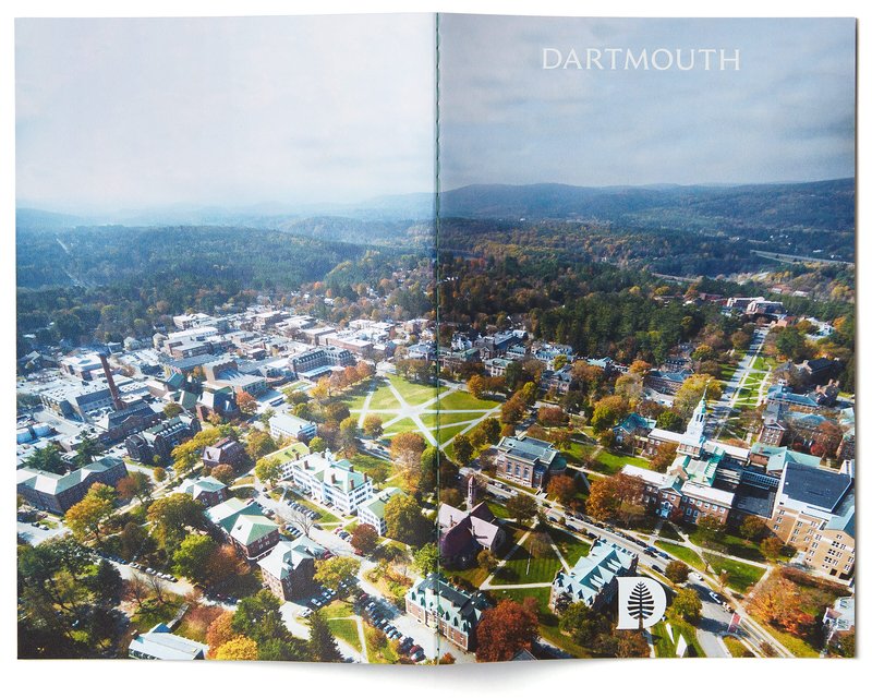
Dartmouth Visual Identity Guidelines by Champions Design
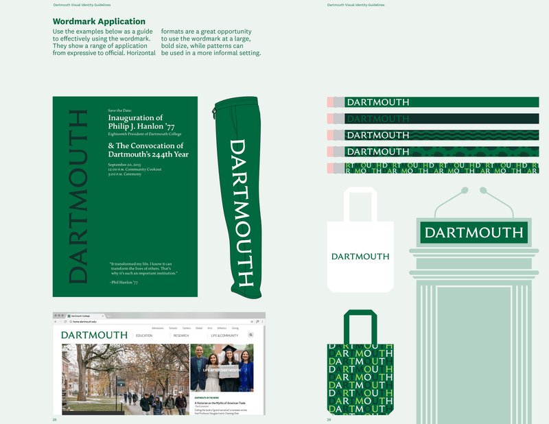
The Dartmouth identity in use by Champions Design
The Dartmouth identity in use by Champions Design
The Dartmouth identity in use by Champions Design
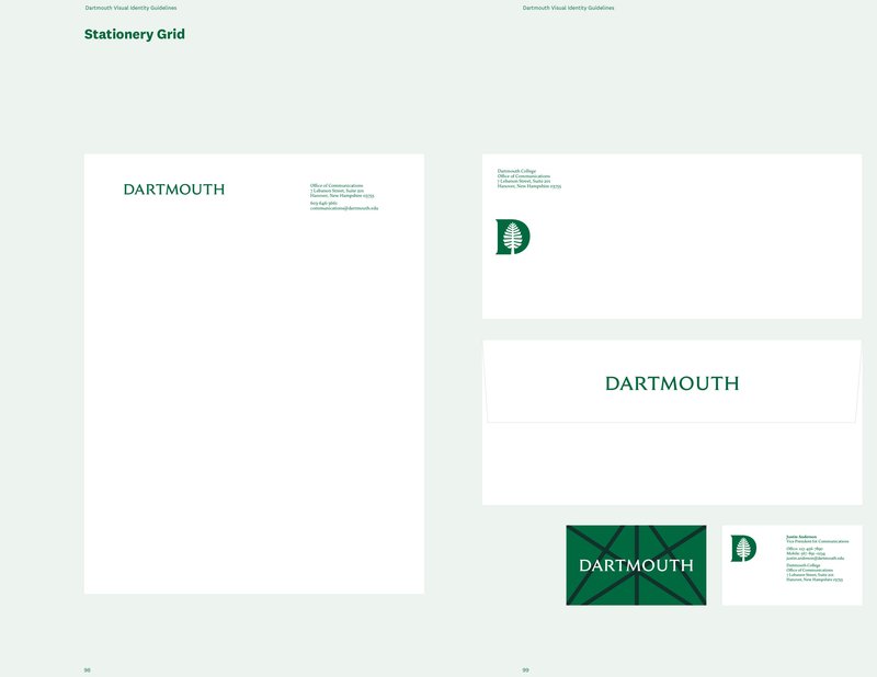
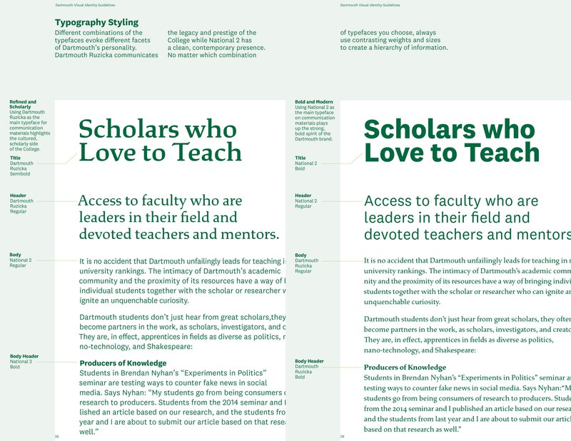
Dartmouth Visual Identity Guidelines by Champions Design
Dartmouth Visual Identity Guidelines by Champions Design
Dartmouth Visual Identity Guidelines by Champions Design
Dartmouth Visual Identity Guidelines by Champions Design
Dartmouth Visual Identity Guidelines by Champions Design
Dartmouth Visual Identity Guidelines by Champions Design
Dartmouth Visual Identity Guidelines by Champions Design
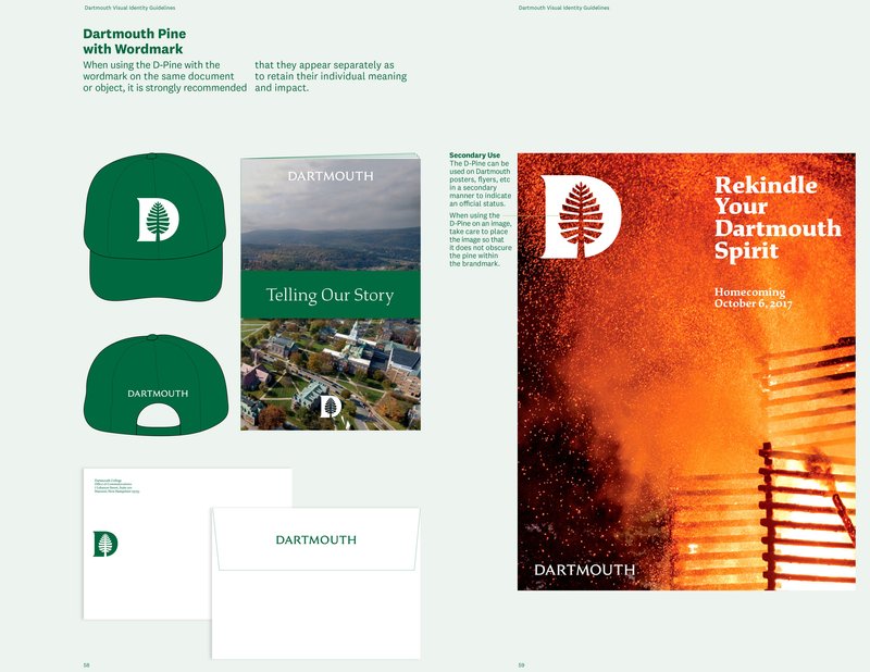
Dartmouth Visual Identity Guidelines by Champions Design
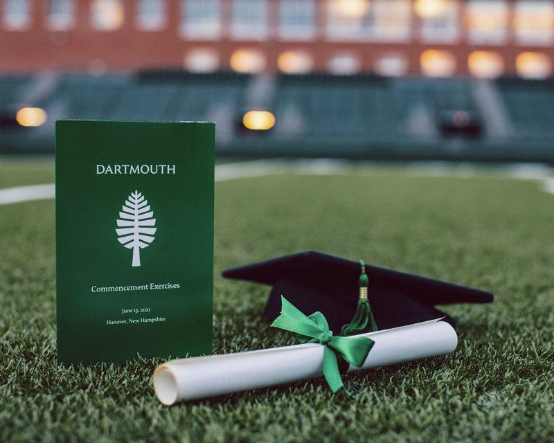
The Dartmouth identity in use
A place of Study
With permission from Dartmouth, Jesse adapted the same design as Study, a retail typeface we publicly released in 2018. As Jesse explains in his detailed article “Making Study,” by making the long-dormant typeface finally available, he hopes to bring new audiences to Ruzicka’s work, extending and honoring its legacy for years to come.
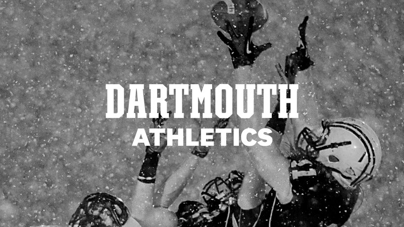
Branding for athletics
In many educational organizations, the athletic departments need to have a visual vocabulary that is distinct from the institutional side, and Dartmouth is no different. Champions Design asked us to draw a logotype for Dartmouth College Athletics.
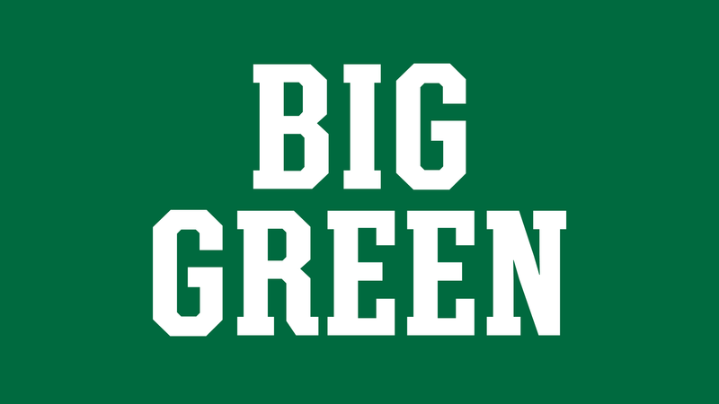
Using a vintage jersey as inspiration for the lettering, Jesse created a strong, authoritative logotype in an established collegiate vernacular, yet drawn from Dartmouth’s unique history.

Dartmouth Athletics logo
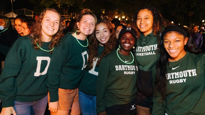
Dartmouth Athletics identity in use
Dartmouth Athletics identity lettering
Dartmouth Athletics logo
Dartmouth Athletics identity in use
In what may be our largest physical font application to date, Jesse came up with a custom “End Zone optical size” for the logotype that perfectly fits the dimensions of the grass end zones at Memorial Field. It is fun to brag about this one because it’s not every day that our fonts are sized up to ten yards tall and are visible from outer space!
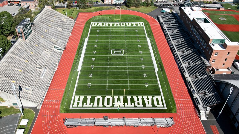
Dartmouth Athletics logo in use on Memorial Field
Further reading and watching
Making Study (XYZ Type)
Dartmouth College case study (Champions Design)
Dartmouth College identity system (Fonts in Use)
Big brands need big type lecture (Bobby C. Martin Jr. at Typographics)
Something old, something new lecture (Jesse Ragan at Type@Cooper)
Speaking with one bold voice (Dartmouth)
A pine for your thoughts (Brand New)