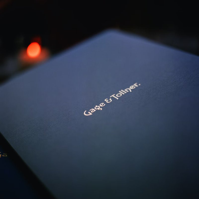
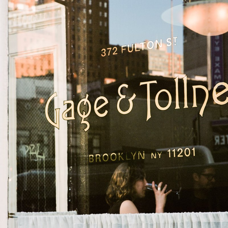
We came to XYZ Type with a rough idea, some historic references, and a really bad sketch. Our collaboration culminated with them delivering typographic gold—literally. It ended up on the restaurant window in gold leaf.
Hamish Smyth, Order
Restoring “The very famous restaurant in Brooklyn”
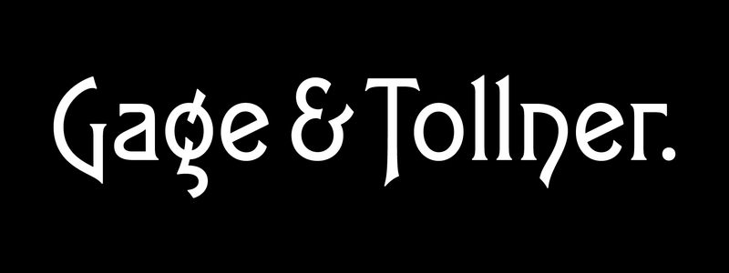
The design studio Order enlisted our typographic expertise to help rebrand the venerable Brooklyn restaurant Gage & Tollner in 2019. We created a logotype and monogram that revolve around historical artifacts, a rather unique typeface, and a vast exploration of ampersands.
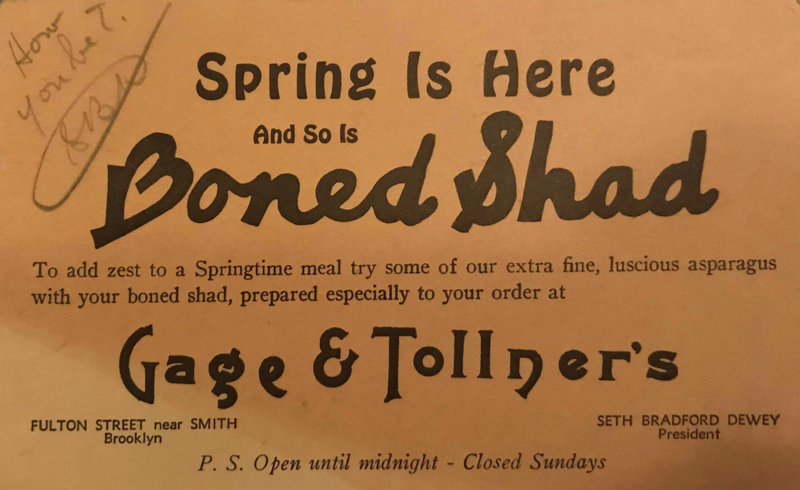
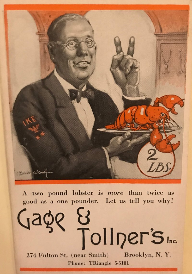
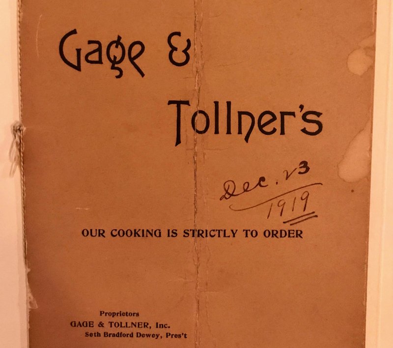
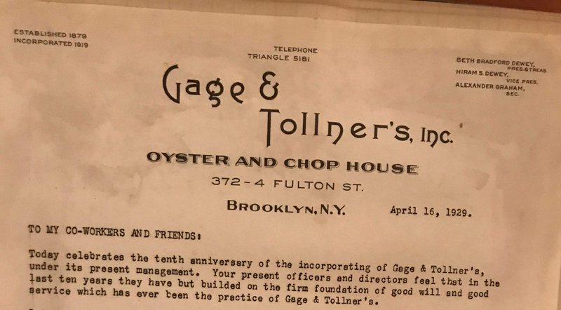
Gage & Tollner was a popular oyster and steak restaurant in Brooklyn, New York that had operated continually since 1879. In fact, for many years, Gage & Tollner billed itself as “the very famous restaurant in Brooklyn”—an indication of both the confidence and the status of this celebrated dining establishment.
After shuttering its doors as a restaurant in 2004, the building housed a clothing store and several fast-food chains. In 2018, three restaurateurs raised money to revive the restaurant to its former glory and reestablish its place in the New York fine-dining scene.
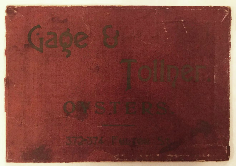
Photo: Gage & Tollner archives
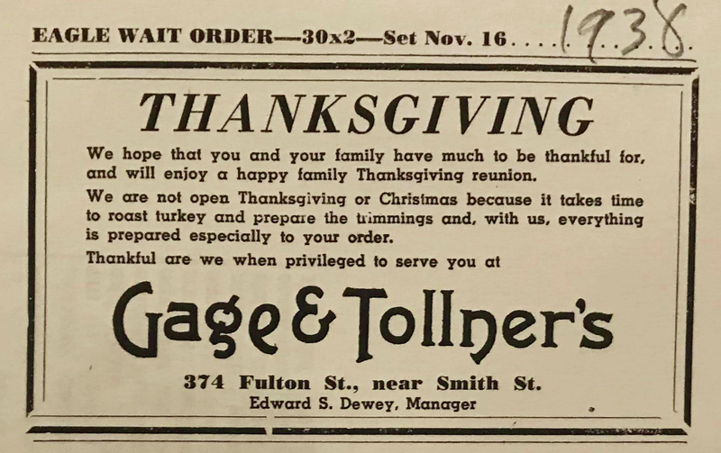
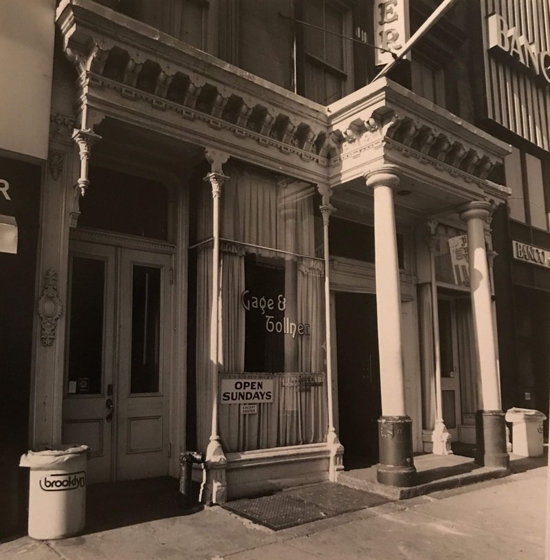
Photo: Brooklyn Historical Society archives
Photo: Gage & Tollner archives
Photo: Brooklyn Historical Society archives
Photo: Brooklyn Historical Society archives
Photo: Brooklyn Historical Society archives
Photo: Brooklyn Historical Society archives
Customizing Art Gothic
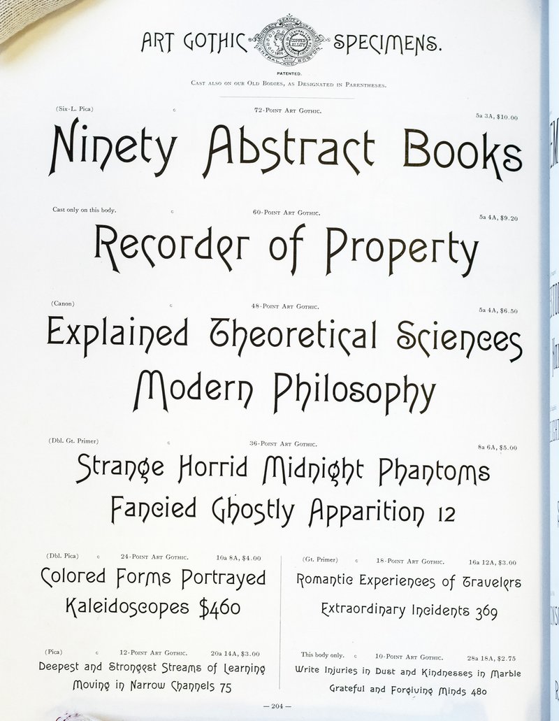
Gage & Tollner has a long history of using the nineteenth-century typeface Art Gothic for its name on signage, menus, and business correspondence. It was the natural choice for the reborn restaurant’s wordmark.
Art Gothic is a wonderfully quirky art nouveau typeface released around 1887 by Central Type Foundry in St. Louis, Missouri (where XYZ Type partner Ben Kiel now lives). Originally inspired by commercial lettering and cut by Gustave F. Schroeder, a patent for the typeface design was filed in February 1886.
The owners were trying to recreate a certain Gage & Tollner ‘aura,’ and getting the typography to fit into that was crucial.
Jesse Ragan, XYZ Type
Art Gothic, from the 1899 Central Type Foundry catalog
Unfortunately, all existing digital interpretations of Art Gothic lacked the sparkle and refinement needed for Order’s new design system, and the original ampersand felt unwieldy. XYZ Type’s expertise became essential at this point.
Jesse Ragan redrew each of the letterforms from scratch, using metal type specimens and historical materials from the Brooklyn Historical Society as a reference. Looking at all of the variations in optical sizes, alternate characters, and serif construction, Jesse chose the ideas that felt most appropriate for Gage & Tollner.
Time was spent crafting each letter to make the overall style of Art Gothic remain, while subtly updating and unifying the logotype. This work was all about finding the right balance between being faithful to the original typeface and making the weights and proportions of the letters more consistent.
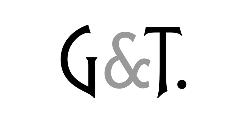
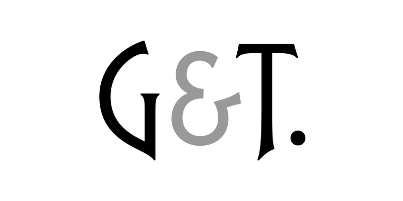
The Gage & Tollner logotype
The final G&T monogram
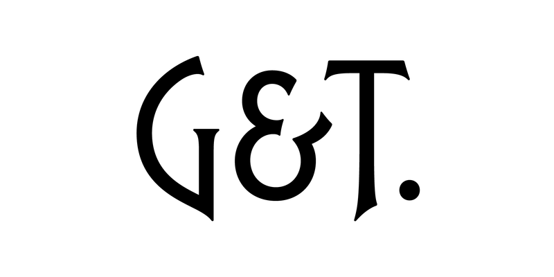
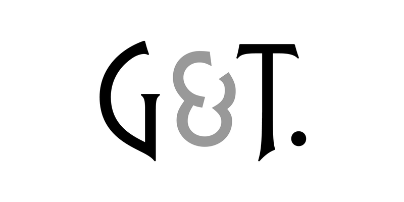
Art Gothic’s original ampersand
A rejected ampersand sketch
A rejected ampersand sketch
A rejected ampersand sketch
A rejected ampersand sketch
A rejected ampersand sketch
About that ampersand
During the process of customizing Art Gothic, Jesse was specifically asked to create an ampersand that—in the client’s words—“didn’t feel so weird.”
The client was right: the original Art Gothic ampersand was too eccentric. It looked as though it was falling backward, the top terminal did not match any of the other letters, and the middle intersection was not consistent with the rest of the typeface.
Jesse undertook period-specific research based on similar typefaces of the era and created several variations that felt consistent with the rest of the logotype while not becoming too conspicuous. The final result balances the words and makes the entire wordmark feel at once rooted in history and also fresh and modern.
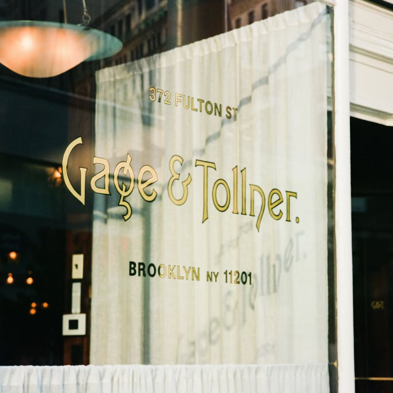
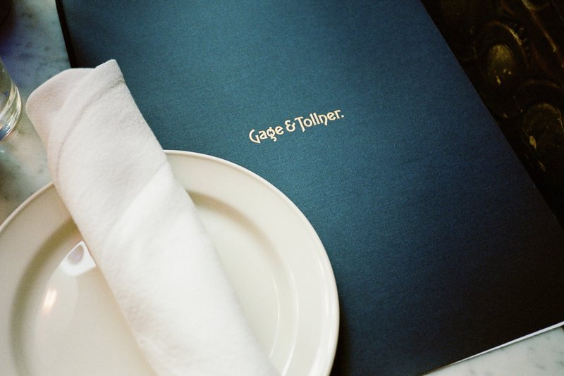
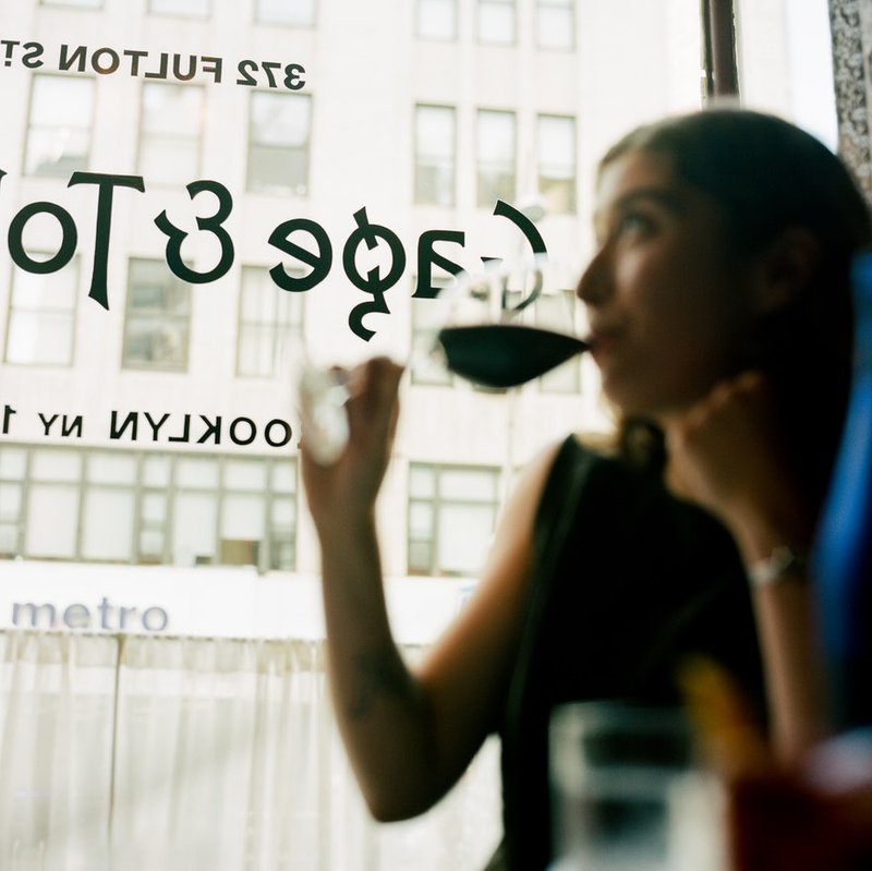
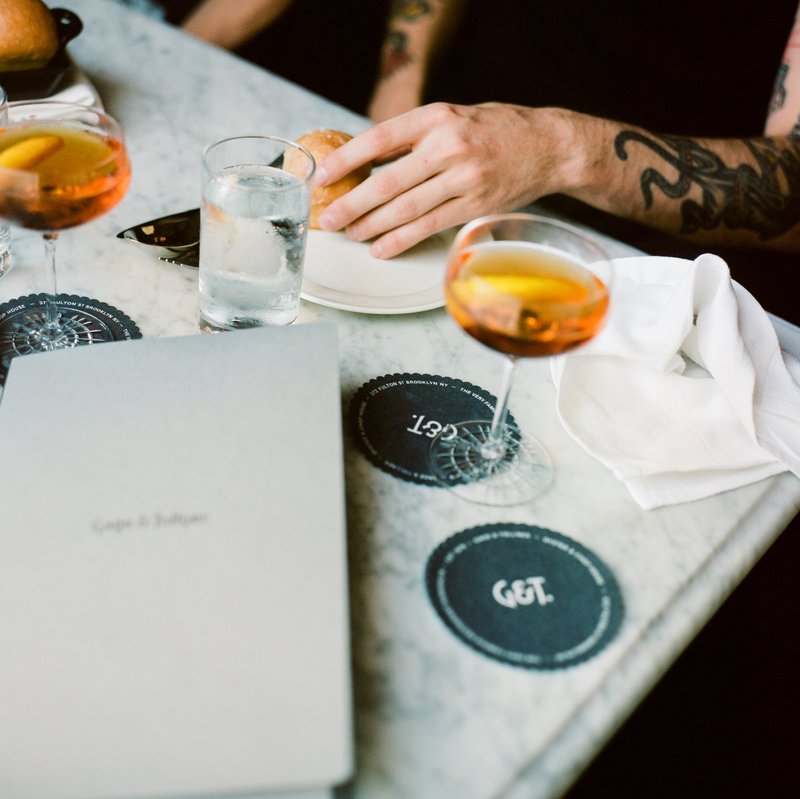
The resulting G&T monogram utilized the ampersand to its most dramatic and stylish effect while giving the restaurant another visual element for use in social media, bar coasters, and window gilding.
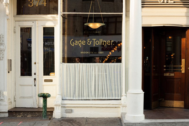
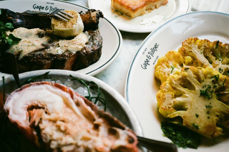
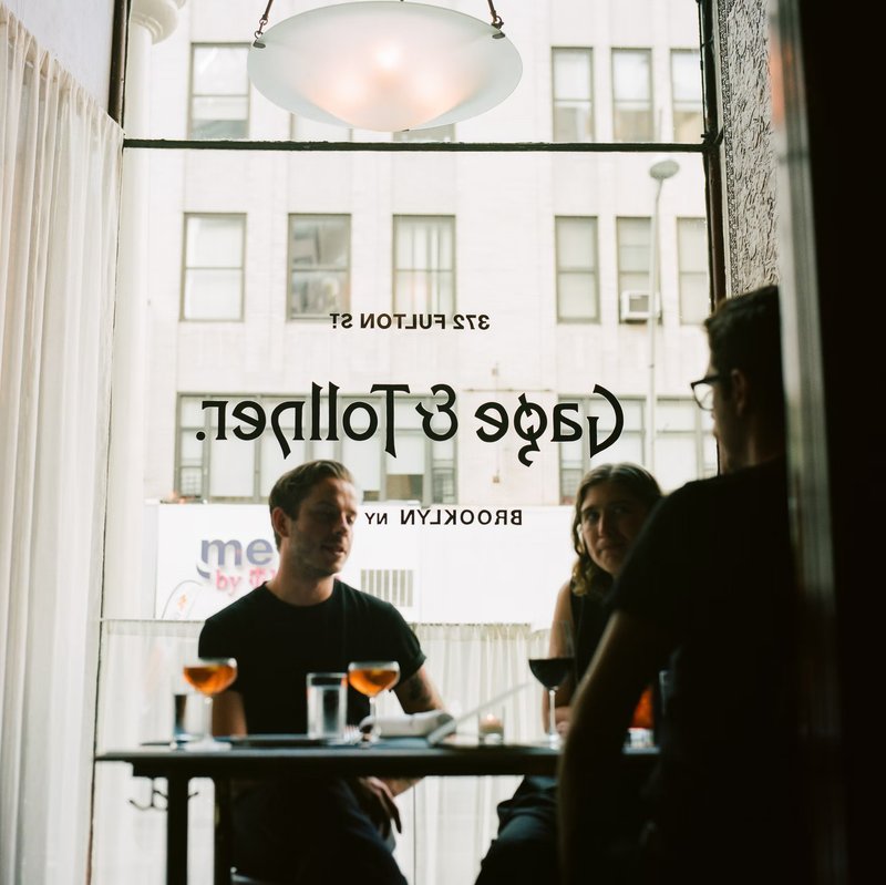
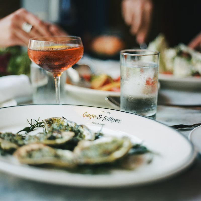
The new mark in use at Gage & Tollner. Photo: Hamish Smyth, Order
The new mark in use at Gage & Tollner. Photo: Hamish Smyth, Order
The new mark in use at Gage & Tollner. Photo: Jesse Reed, Order
The new mark in use at Gage & Tollner. Photo: Hamish Smyth, Order
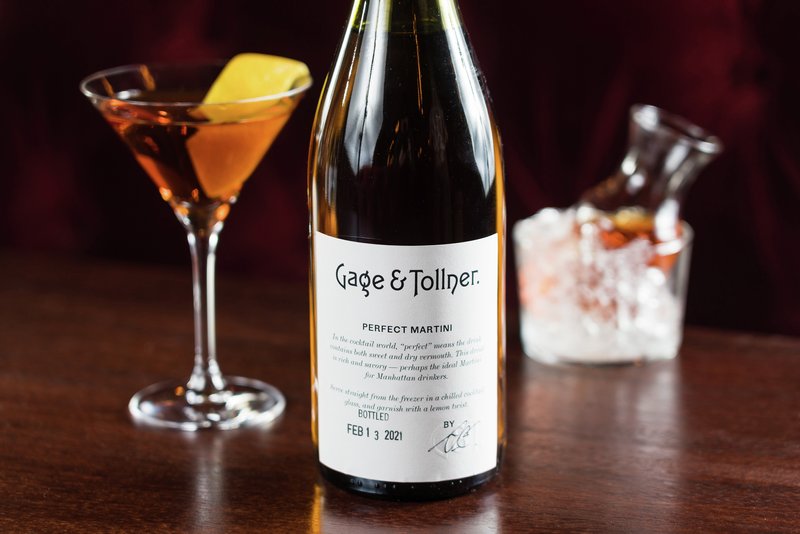
The new mark in use on a label. Photo: Gage & Tollner
The new mark in use at Gage & Tollner. Photo: Hamish Smyth, Order
The new mark in use at Gage & Tollner. Photo: Hamish Smyth, Order
The new mark in use at Gage & Tollner. Photo: Jesse Reed, Order
The new mark in use at Gage & Tollner. Photo: Hamish Smyth, Order
The new mark in use at Gage & Tollner. Photo: Jesse Reed, Order
The new mark in use at Gage & Tollner. Photo: Hamish Smyth, Order
XYZ Type was instrumental in helping us revive the brand of a storied Brooklyn establishment. Their historical type knowledge, attention to detail, and craft are as good as it gets.