When you think about beer from St. Louis, Missouri, a multinational conglomerate may come to mind—but there is also the original independent craft brewery in town: The Saint Louis Brewery, also known as Schlafly Beer.
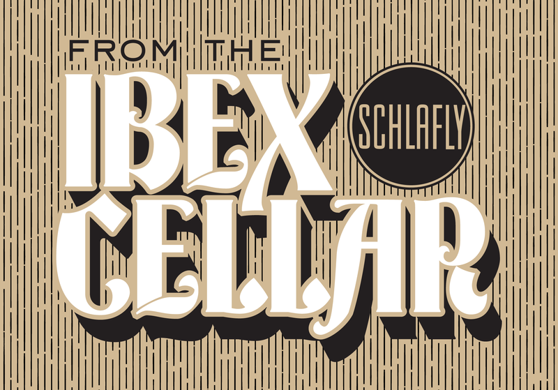
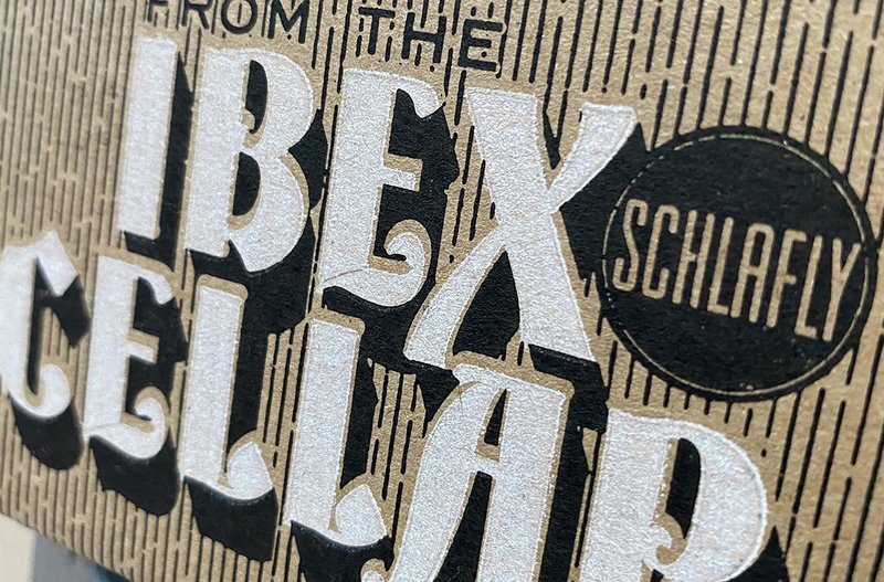
Custom lettering for Ibex Cellar
A national landmark building
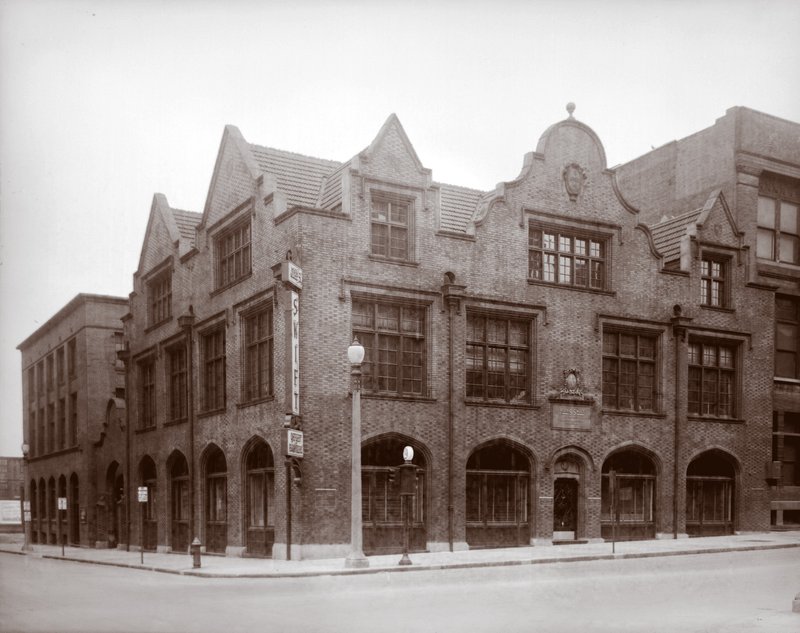
The John S. Swift Company building on the southwest corner of the intersection of Twenty-First and Locust Streets in Saint Louis, Missouri. Photo: the Sievers Studio, image from the Missouri Historical Society, St. Louis
When the brewery started business in 1991, they purchased a century-old building in St. Louis that had been built and occupied by Swift Printing Company for 65 years. The building was constructed with large steel girders to support heavy printing presses, which just so happened to be perfect for the weight of brewing equipment as well.
XYZ Type brought history to life for the limited-edition Ibex Cellar beers brewed and stored in the cellar of the former printing establishment. Naturally—being a St. Louis resident—Ben Kiel was thrilled to dig into the history of printing and typography in St. Louis.
Working with Ben was a pleasure. The collaboration was synergistic, and the result has worked well across multiple printing processes.
Sarah Frost, Senior Designer, The Saint Louis Brewery
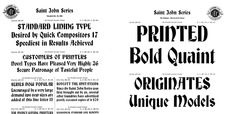
Images: The Saint John Series, 1901 Inland Type Foundry catalog
Searching for the right inspiration
Working with Sarah Frost, the senior designer, Ben created several typographic options for the Ibex Cellar logotype that had connections to printing history and St. Louis. Two concepts leaned heavily on unique wood type specimens and a third was based on an original typeface released by St. Louis’s Inland Type Foundry: Saint John.
The Inland monogram advertising their Standard Line type was too good not to try and work into the logotype. Interpreting the design digitally, Ben tried several options incorporating the decorative border in digital form. Sadly, it wasn’t chosen, but that doesn’t mean he didn’t have fun making it.
Unused logotype options
The Saint John Series
Inland released Saint John, a typeface designed as an interpretation of Will Bradley’s Art Nouveau-inspired lettering, in 1895. During this time, there was an explosion of experimentation with advertising typography, and this typeface—with its connections to the Arts and Crafts Movement and the designer William Morris—appears to have been a popular hit for Inland.
In retrospect, the selection of Saint John almost feels obvious: its blackletter style matches the dark, barrel-aged beers that are stored in the cellar of the building. The in-house design team felt the combination of a unique St. Louis typeface that had not been digitized and the direct connection to printing was a perfect fit.
Ben brought an extensive knowledge of period typefaces to the project and was able to merge this sensibility with a modern twist to create a unique mark.
Sarah Frost
The lockup with pattern
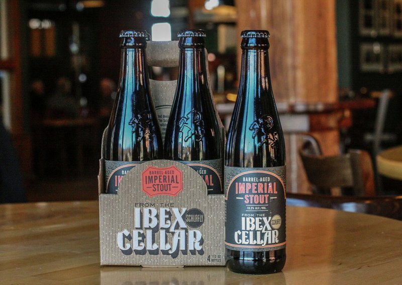
Printed packaging
A flexible package system with a unique design
To help finalize the logotype and packaging, Ben created a “wood-grainy” pattern for the background and custom lettering for the phrase “FROM THE,” based on a simple, wide geometric sans serif typeface also from Inland. Together, these elements add up to a limited-edition beer packaging system that the brewery can use over time as new beers are released. The fact that the logotype is directly rooted in St. Louis printing and typographic history reinforces both the pride the company puts into its beers and Ben’s pride in St. Louis type.
Footnotes
Founded in 1894 by three brothers after the sale of the Central Type Foundry by their father, Inland was one of the most successful type foundries in the United States. They provided high-quality metal type to St. Louis and much of the Midwest—eventually setting up offices in Chicago and New York City.
Inland heavily advertised their “Standard Line” type, which meant that all of their type was measured by the point system and had a consistent baseline for the same body size. This standardization was state-of-the-art at the time and eventually became standard for all type foundries in the United States. To advertise this fact, they used a monogram of their initials surrounded by decoration on every page of their 1897 specimen book.