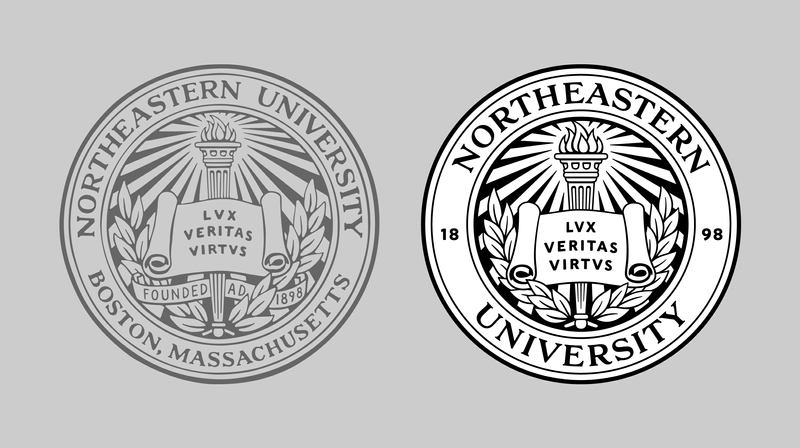
XYZ Type helped Boston-based studio Upstatement design an extensive identity system for Northeastern University that included a typeface, a logotype, a monogram, lettering, and even illustration—but it all started because the school needed to remove the words “Boston, Massachusetts” from their seal.
Northeastern had grown and expanded beyond their original campus, and they asked Upstatement to create a simplified seal, untethered by location and optimized for use everywhere from screens to enormous signage. Knowing this challenge required typographic finesse, Upstatement partnered with XYZ Type—and the project grew from there.
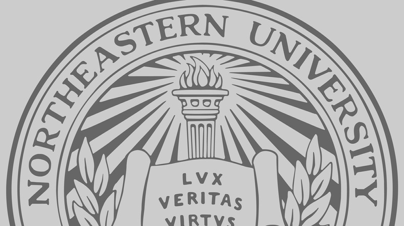
The poorly autotraced historical seal that Northeastern University was using in all of its print and digital applications lacked nuance and became distractingly lumpy at large sizes. Upstatement tapped Jesse Ragan to make both the lettering and the illustrations clear and elegant in all applications, with a few updates.
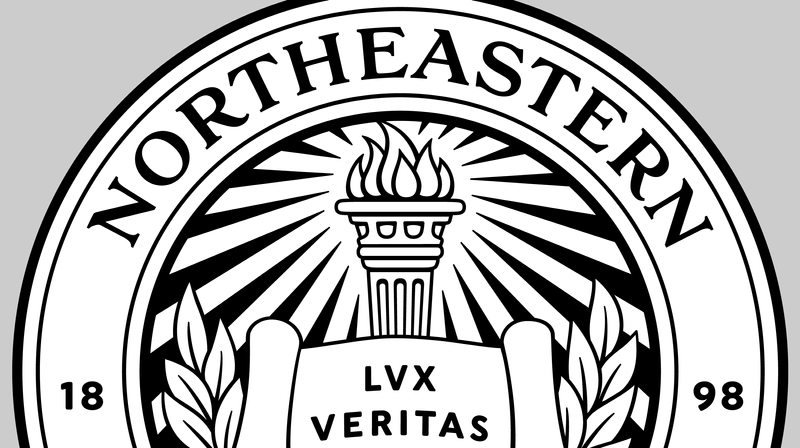
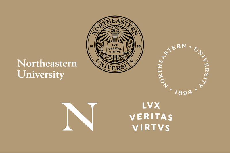
He started by redrawing the torch, motto, scroll, and laurels with less visual clutter. Removing two words from the ring made space for “Northeastern University” to gain size and focus. No existing typeface was a perfect match for the historical lettering, so Jesse faithfully reinterpreted the glyphs in crisp, clean vector outlines.
Drawing letters on a curve presents special challenges, as letterforms can quickly get deformed or distorted out of visual balance, looking like they belong on a circus poster. Rather than warping the shapes in an arc or rotating each letter, Jesse meticulously drew them with a slight arch to the top and bottom of the letters and a slight fanning of the vertical strokes within.
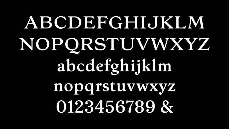
After demonstrating dramatic improvements to the seal, Upstatement persuaded Northeastern to dig deeper into rethinking their identity system—a lot deeper. Their broad strategy included replacing off-the-shelf Baskerville with a brand new logotype and a matching typeface, inspired by the lettering in the seal. The two would function seamlessly together for department name lockups and any future unexpected growth.
Jesse stepped in again. His design process started with the “test characters” N U a e h i n o r s t v y, since the letterforms in the school’s name established the tone of the logotype and carried it into the supporting typeface.
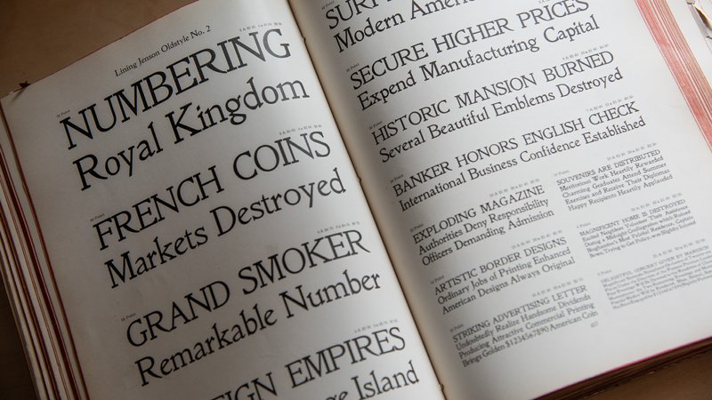
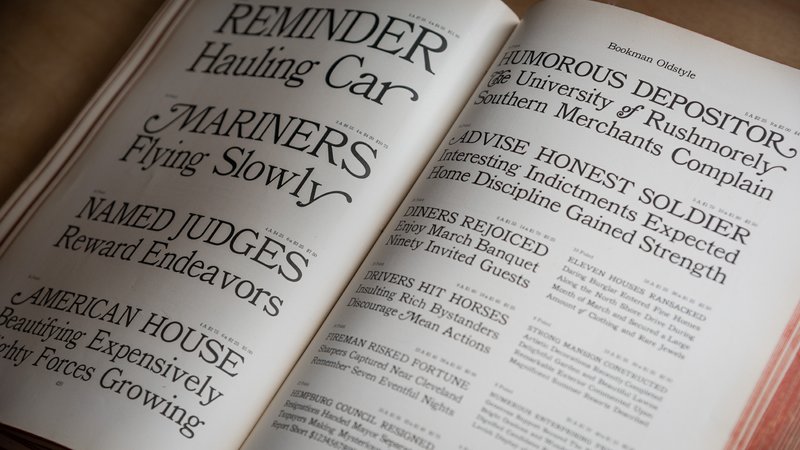
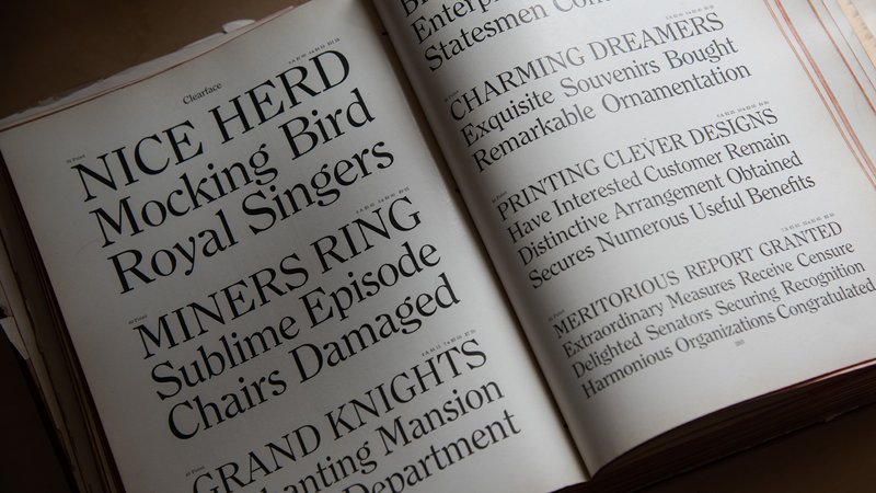
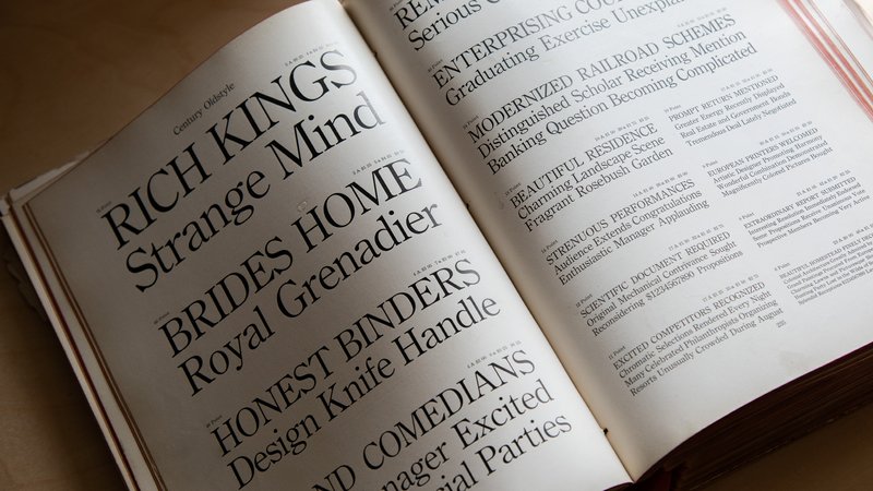
Lacking a direct reference for the lowercase letters, Jesse showed Upstatement a variety of typefaces that were popular around the time of the school’s founding and resonated with the capitals in the seal. Through collaborative discussions with the design team, he established a new visual style distilled from several faces offered by American Type Founders in the early 1900s: Jenson Old Style, Bookman, Century Old Style, and Clearface.
Speare, Northeastern’s custom typeface, doesn’t directly match any of those references, but it captures the spirit of a time period and the aesthetic foundation of the seal.
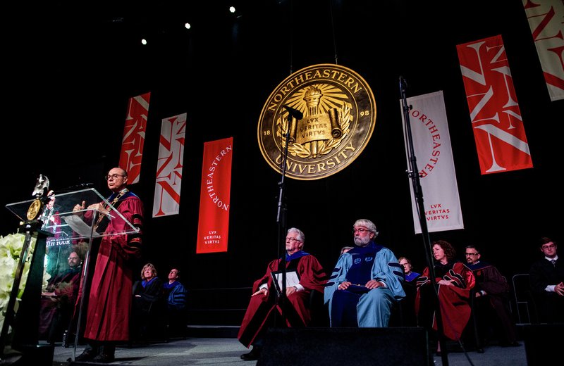
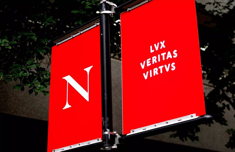
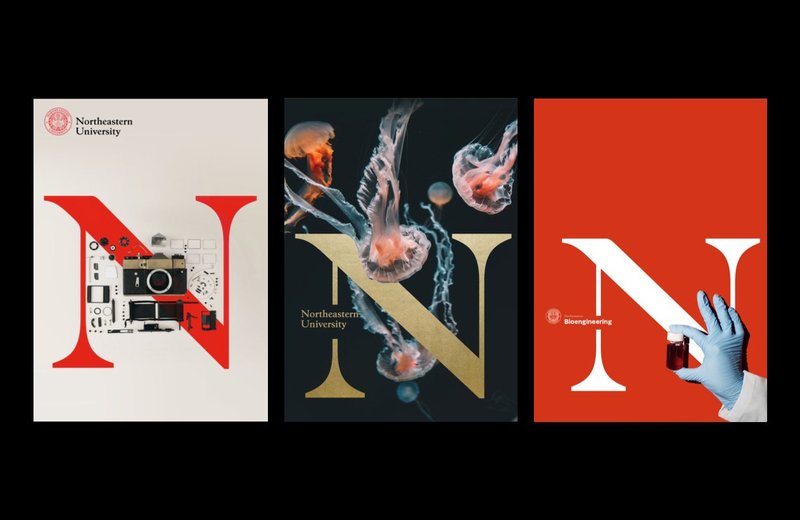
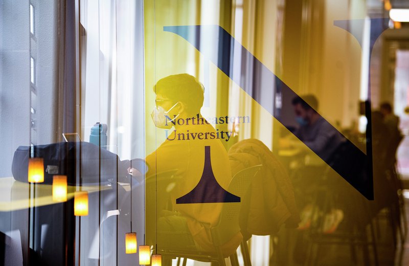
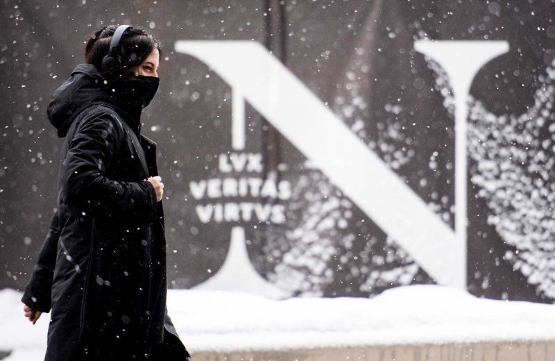
As Upstatement developed the full identity for Northeastern, they scaled the seal’s ring lettering and motto to heroic sizes, establishing a dynamic contemporary system that highlights the school’s history.
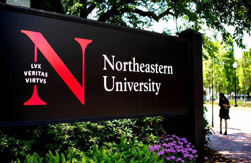
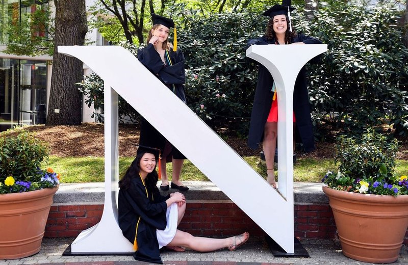
The logotype’s N became a monogram and a defining mark for the school. Large-scale use warranted optical adjustments, so Jesse sharpened the serifs and made the stems more delicate. In a clear embrace of the monogram, Northeastern’s in-house designers fabricated a life-size N, which has become a popular photo opportunity for graduating students.