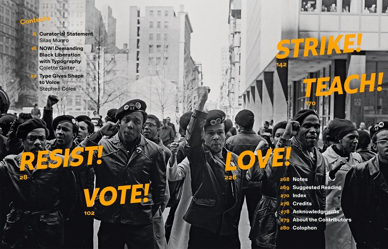
Once in a while, a project comes along that pushes our creative limits and commands personal and professional growth. We knew we were in for that kind of wild ride when Polymode asked us for a typeface that would reflect their design studio, represent their multifaceted identities, and be useful in their wide-ranging work.
Custom typeface for Polymode
Polymode Sans
An exceptionally expressive project
We approached XYZ with a question. It wasn’t just ‘we want a typeface,’ it was more: How does, or can, a typeface dynamically express a point of view while also being able to remain ‘neutral’? Ben and Jesse were phenomenal listeners and started by encouraging us to submit visual references that moved well beyond typefaces, consisting of personal and professional lineages—including BIPOC and LGBTQIA+ voices.
Brian Johnson & Silas Munro, Polymode
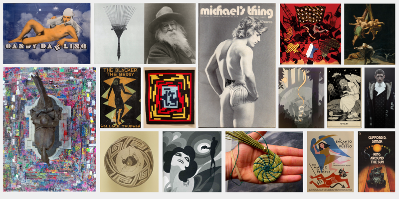
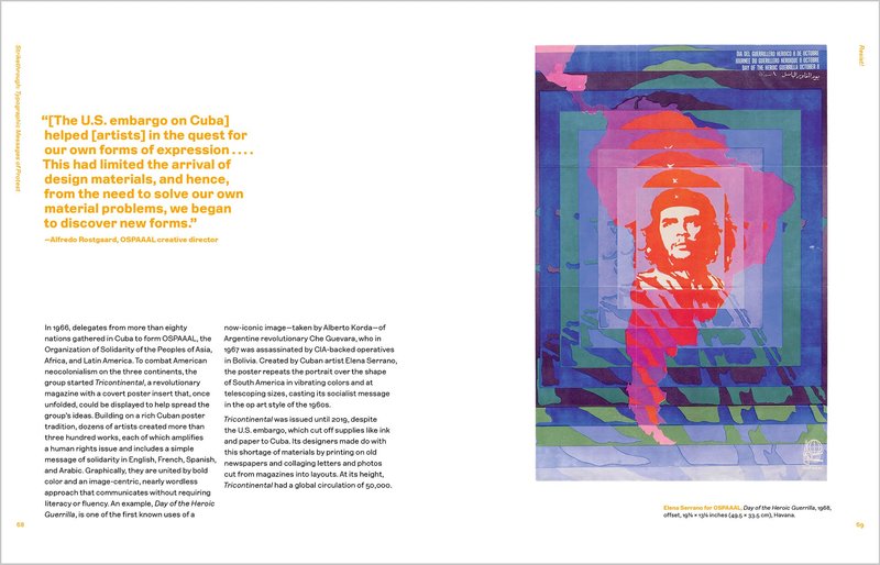
Sample images from Polymode’s poetic, all-embracing research
Poetic research
As part of Polymode’s practice of poetic research, they provided a provocative collection of images drawn from their interests and personal identities: magazines from the Harlem Renaissance and ’80s gay nightlife, handcrafts from Indigenous America and Uganda, works by Goya and Poe, and so much more. Viewed as a whole, these images provided an impressionistic definition of “Polymode”—both the typeface and the studio.
Polymode also gave us a direct, but open-ended, list of needs and demands for how the typeface should feel and how it would be used in their work.
Our request was complex, we had expressive needs and functional demands. Polymode Sans needed to work well in running text, feel at home in an art book, but also meet the demands of our contemporary screen-based world. The type needed to have the right amount of friction—noticed but not annoying. We also asked them to let that friction be more noticeable in display sizes.
Brian Johnson and Silas Munro, Polymode
Practical research
As we wrapped our heads around the elusive voice of Polymode, we turned to our own archives, searching for ways to express it in typographic form. We pulled historical type specimens from our shelves and dug through our collected photos of vernacular lettering, pulling the aesthetic and conceptual threads together.
We proposed a variety of concepts inspired by this research, pushing to the extremes of what we felt would fit the brief. To our surprise, Silas and Brian were drawn to the idea of reviving the comparatively tame historical typeface Lining Gothic, originally designed by Charles H. Beeler Jr. and released around 1885 by MacKeller, Smiths & Jordan Company.
The typeface would meet the primary purpose of the assignment: balancing functionality with personality. Beyond its buttoned-up first impression, some unexpected charisma commands closer attention, such as the flat horizontal strokes of g, s, and y; the hook-arched r; and the non-aligned crossbars of f and t.
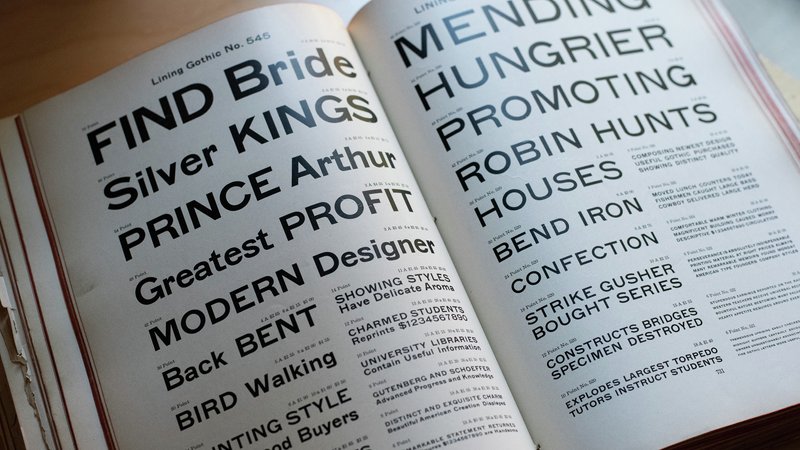
Lining Gothic, from 1912 American Type Founders catalog
Let’s get weird
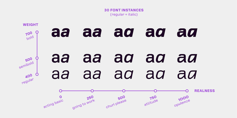
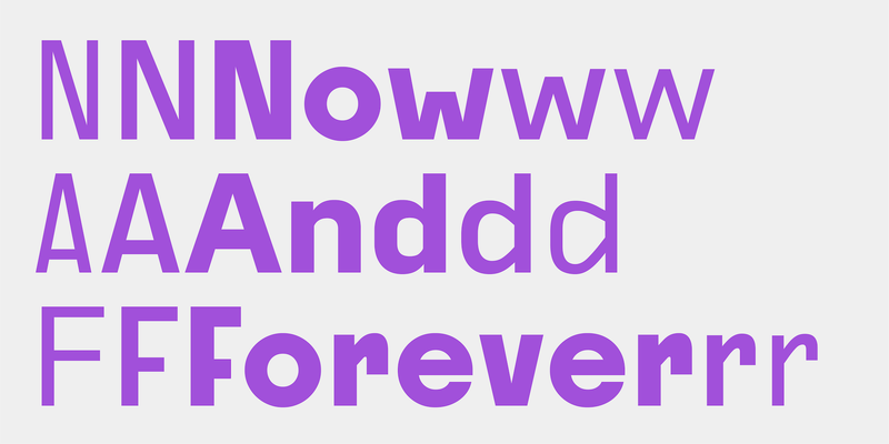
Although Lining Gothic spoke to the personality of Polymode, we all agreed that our typeface ought to be a bit more, well, polymodal. We explored ideas of elaborate ligatures and unorthodox alternates, but ultimately we hit upon the best way to provide a range of voices: a variable font.
We started with a direct digital revival of Lining Gothic and quickly started asking: What would this typeface look like if we stripped away all of its eccentricities? What if we dialed those quirks up to the max? Building this thinking into a variable font axis enabled a wide range of expression with fine-tuned control.
Throughout our design process, we shared updated in-progress fonts with Polymode. Their immediate feedback from using the typeface in real-world projects enabled us to revise and update it quickly while refining the final product. Consistent requests that we “make it weirder!” pushed us further away from our comfort zone and closer to theirs.
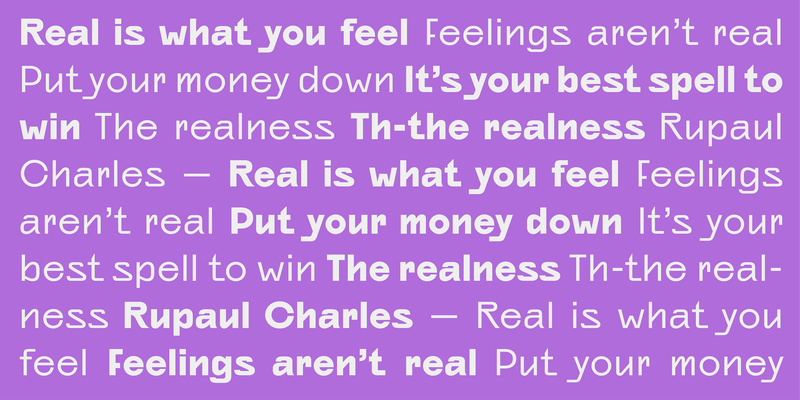
A demonstration of the unique Realness axis in Polymode Sans
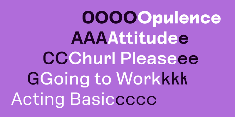
From Acting Basic to Opulence
Polymode Sans came into its own as a variable font with an invented Realness axis on which the characters get progressively more expressive and harder to ignore. The Realness settings range from Acting Basic to Opulence, with stops along the way at Going to Work, Churl Please, and Attitude. (Choosing these names may have been the most fun part of the project for Silas and Brian.)
Realness articulates the studio’s wide range of voices and shifts modes for their diverse work. As Brian says, “Sometimes I need to be buttoned-up and sometimes I want to flip my hair and be a little bit much—and it depends on the day.”
Ultimately, XYZ Type gave us an uber flexible and polymodal type family. Jesse and Ben’s breadth of type knowledge, history, and their joy amidst creation, was, and is, so evident in our work together. We couldn’t have asked for better collaborators.
Brian Johnson and Silas Munro, Polymode
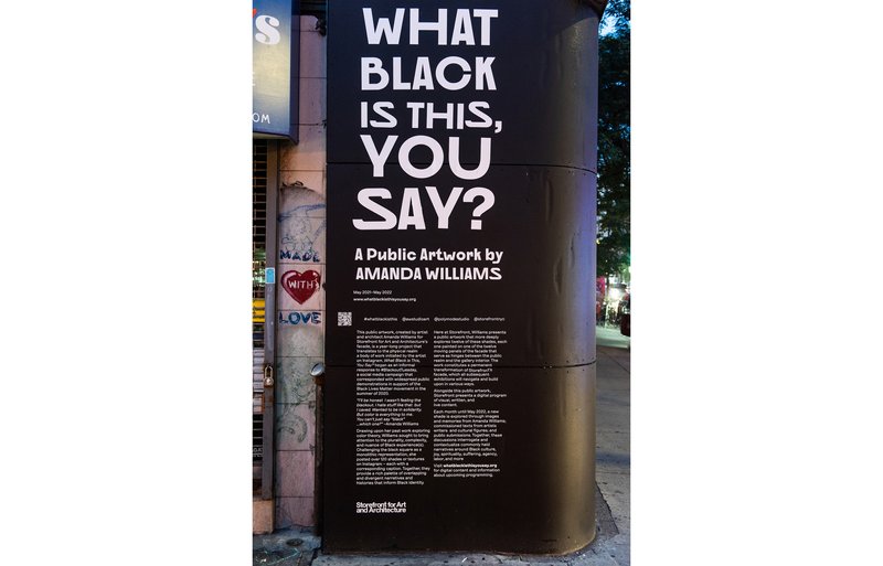
What Black Is This, You Say? by Amanda Williams at Storefront for Art and Architecture, 2021–2022. Exhibition design by Polymode using Polymode Sans. Photo: Michael Oliver
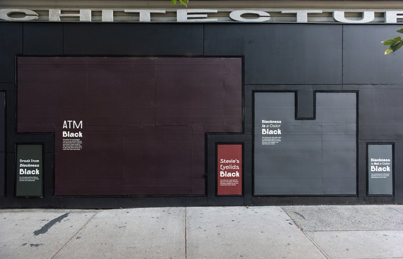
What Black Is This, You Say? by Amanda Williams at Storefront for Art and Architecture, 2021–2022. Exhibition design by Polymode using Polymode Sans. Photo: Michael Oliver
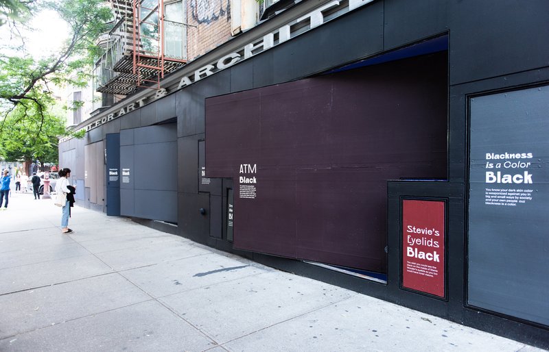
What Black Is This, You Say? by Amanda Williams at Storefront for Art and Architecture, 2021–2022. Exhibition design by Polymode using Polymode Sans. Photo: Michael Oliver
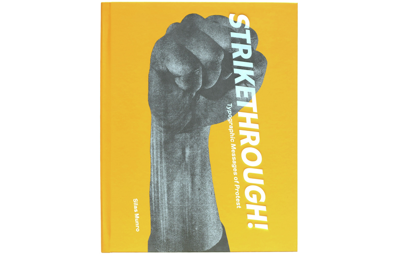
Strikethrough exhibition catalog, designed by Polymode using Polymode Sans and Tré Seals’s typeface Equals
Strikethrough exhibition catalog, designed by Polymode using Polymode Sans and Tré Seals’s typeface Equals
Strikethrough exhibition catalog, designed by Polymode using Polymode Sans
Strikethrough exhibition catalog, designed by Polymode using Polymode Sans
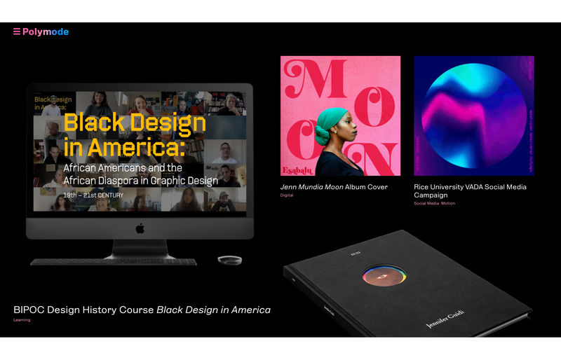
Polymode Sans in use by Polymode at polymode.studio
Polymode Sans in use by Polymode at polymode.studio
Polymode Sans in use by Polymode at polymode.studio
Coming soon, available now
Our plan has always been to make Polymode Sans publicly available, but we still consider it a work in progress. While we continue to add lighter weights and generally make it a bit more fabulous, you can purchase a license to the current version to start using a typeface that responds to how you’re feeling today.
The typeface itself encapsulates the joy of type design and what you can do with it and what typefaces are for—which is expression.
Nadine Chahine, I Love Typography
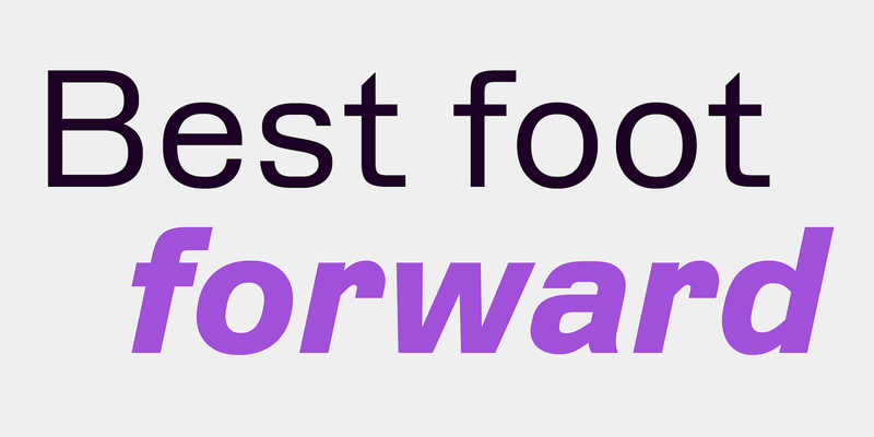
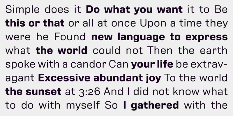
Polymode Sans
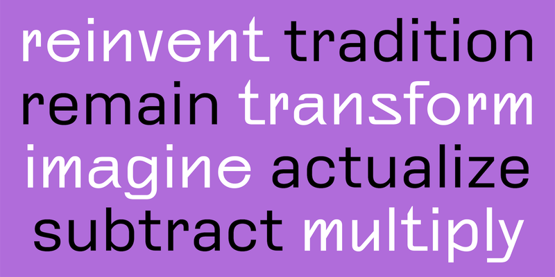
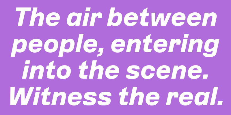
Polymode Sans
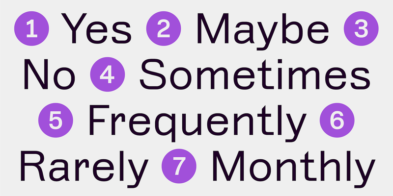
Polymode Sans
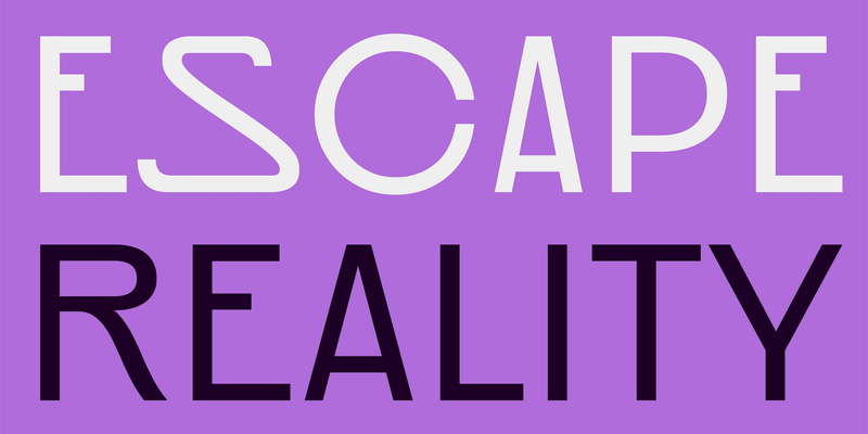
Polymode Sans
Polymode Sans
Polymode Sans
Polymode Sans
Polymode Sans
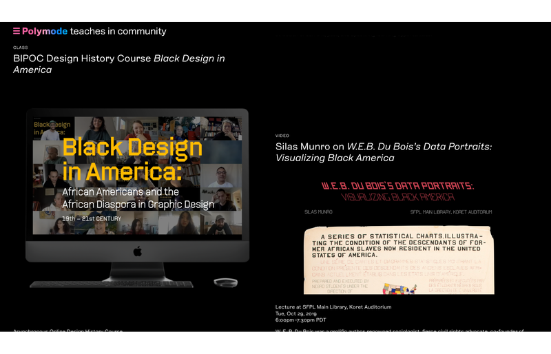
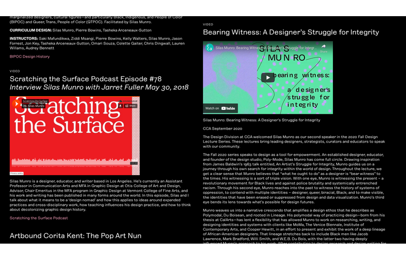
Further reading and watching
What is Realness? Freeing type from a fixed viewpoint lecture (Type@Cooper on Vimeo)
Polymode Sans case study (Polymode)
Polymode, a studio and a custom typeface lecture (I Love Typography)
Give me twirl or clutch them pearls (Type Network)
How do you craft a typeface that reflects a design studio? (It’s Nice That)
The name “Polymode” is a trademark of Polymode.