The Sir Kensington’s logotype started with a client who knew exactly what they wanted—just not how to execute it perfectly. We collaborated to make the final logotype like their Dijon mustard: delectable with a touch of spice.
Custom lettering for Sir Kensington’s
A deliciously novel wordmark
Establishing historical context
Creative director Kimiyo Nakatsui and Sir Kensington’s in-house agency had done extensive exploration and arrived at a tight concept for a new logotype that established the company’s intended hierarchy, composition, and aesthetic. They recognized when it was time to ask for help polishing their rough idea, and they were excited to go on a journey with us.
As a first step, we posed the question to their internal design team: What specifically is this lettering trying to evoke?
We cracked the books to find the answer. By referencing archival drafting manuals, Speedball lettering guides, and historical bookseller labels, we collectively built a stronger foundation under what otherwise might be vague Victorian pastiche.
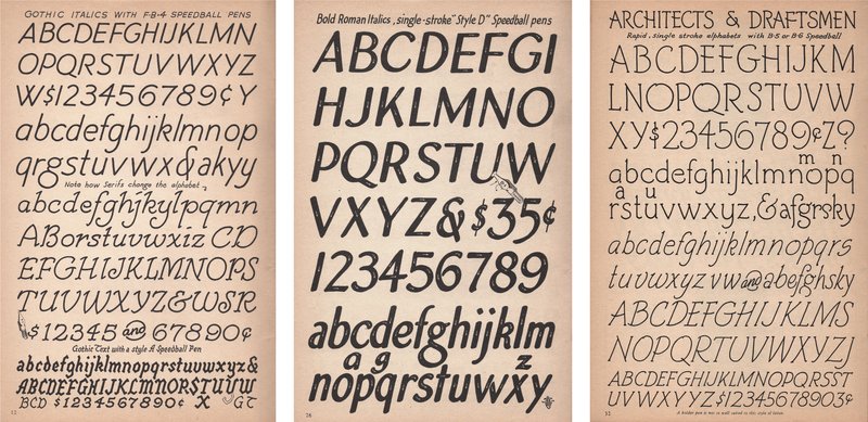
Images: Speedball Textbook for Pen & Brush Lettering, 17th ed., by Ross F. George (1956)
Jesse did a wonderful job bringing the Sir Kensington’s logo to life. He pushed our initial ideas into a better territory with his extensive typographic knowledge, producing a highly legible wordmark which was quite a feat for a long and complex name.
Alayna Citrin, senior designer, Sir Kensington’s
Some of Jesse’s early exploratory sketches
Some of Jesse’s early exploratory sketches
Some of Jesse’s early exploratory sketches
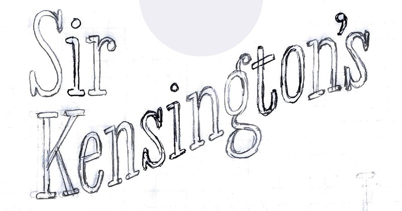
Some of Jesse’s early exploratory sketches
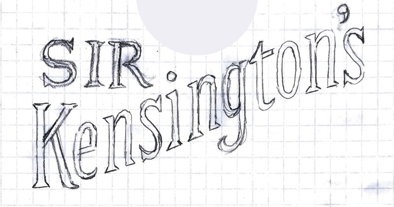
Some of Jesse’s early exploratory sketches
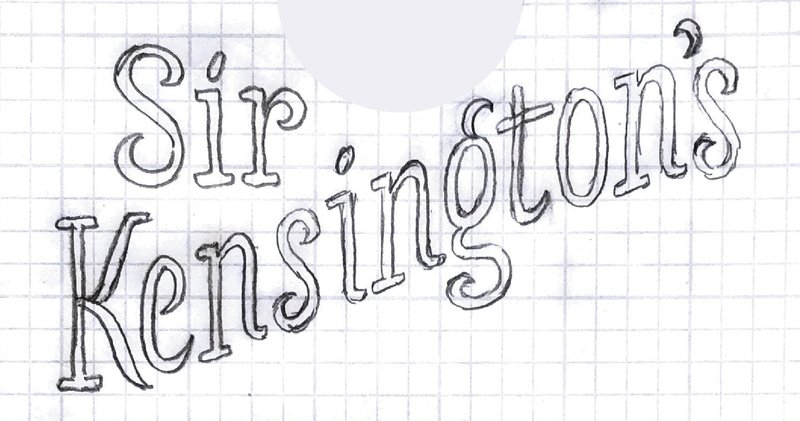
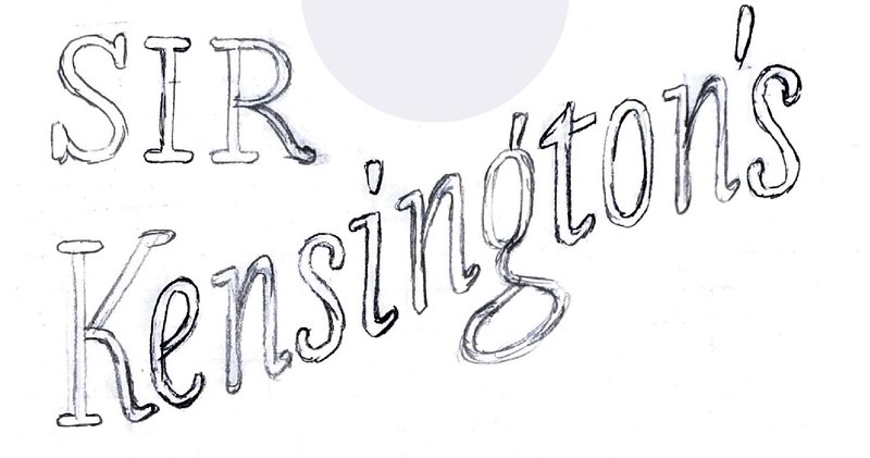
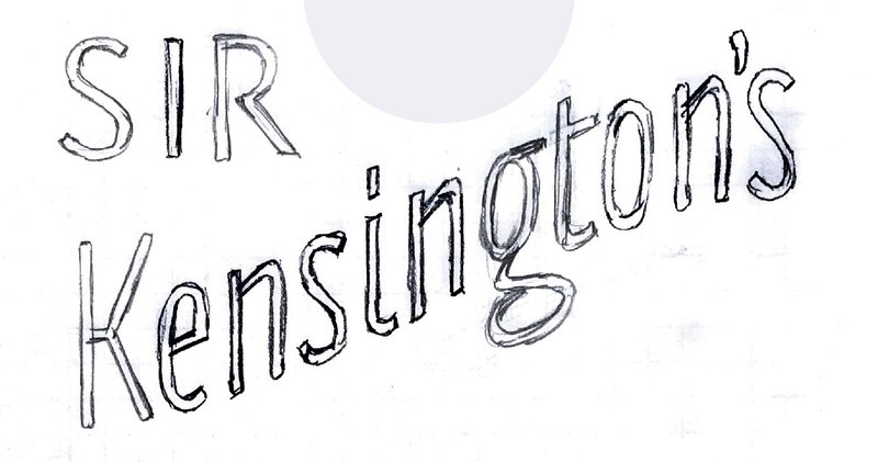
Sketching by hand
Our final deliverables were of course digital, but initially Jesse stepped away from the computer and brought a human touch to the design process with old-fashioned pencil and paper. These loose sketches, which “tried on” various typographic styles and structural details, sparked an insightful discussion with the design team.
With newfound focus, Jesse brought these more organic drawings back to the computer to explore weight, structure, proportions, and curves, before fine-tuning the vector drafting.

Searching for the perfect g

Searching for the perfect g
Searching for the perfect g
Searching for the perfect g
Searching for the perfect g

The final g
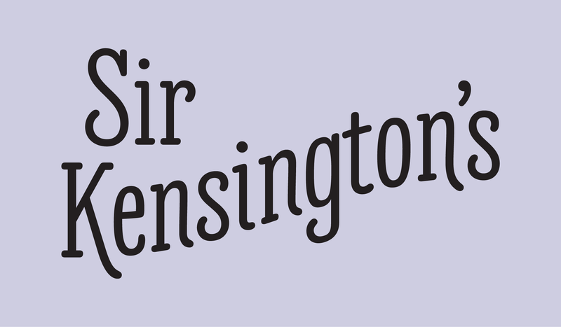
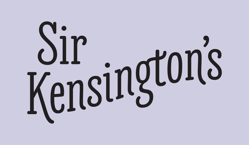
The result is a wordmark like no other—a deliciously novel footprint and letterforms that keep up with the character and charm that come with Sir Kensington himself.
Sir Kensington’s case study
The previous Sir Kensington’s logo
The in-house agency’s concept sketch
The new Sir Kensington’s logo
Finding the right character and balance
Relying on our instincts and extensive exploration, we found the right visual balance in a unique lockup of elements: an illustration, a very short word, and a very long word. After much trial and error, we arrived at the perfect curve and upright italic structure for the word “Kensington’s,” paired with a strong baseline and roman serif structure for “Sir.”
In the word “Kensington’s,” a playfully extended leg of the K sets off a series of kicks at the exits of the n, i, and second n, slowing to a swash on the final n, which nestles against the last s under the apostrophe. Since the lowercase g provides an opportunity for expressive personality, Jesse indulged in creating a number of options for it. Rather than resorting to an exaggerated ear on top—which would compete with the illustration—he ultimately chose a subtle curl for it, shifting the visual excitement toward a loose, expressive lower loop in the negative space under the arch.
These whimsical details soften the simple, legible letterforms into a memorable wordmark that underscores the brand’s overall strategy: to evoke curiosity, wonder, and delight.
These days, when we walk down the condiments aisle of our local grocery store, we can’t help but smile at the cheerful bottles of mayonnaise and mustard that we had a part in making just a tiny bit tastier.
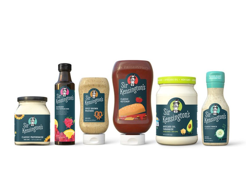
The Sir Kensington’s identity in use
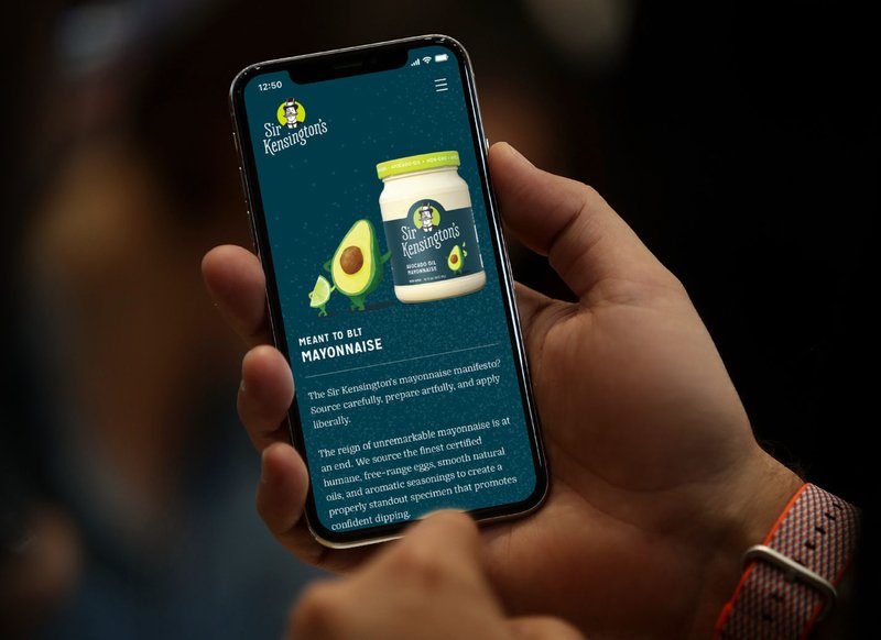
The Sir Kensington’s identity in use
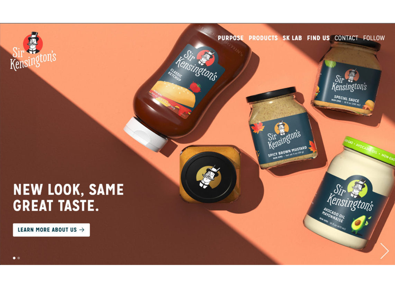
The Sir Kensington’s identity in use
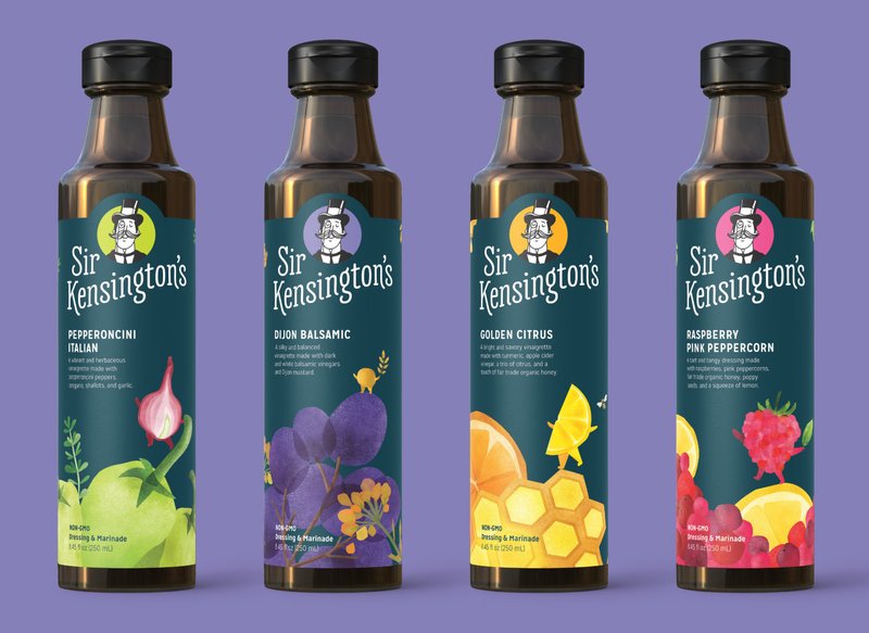
The Sir Kensington’s identity in use
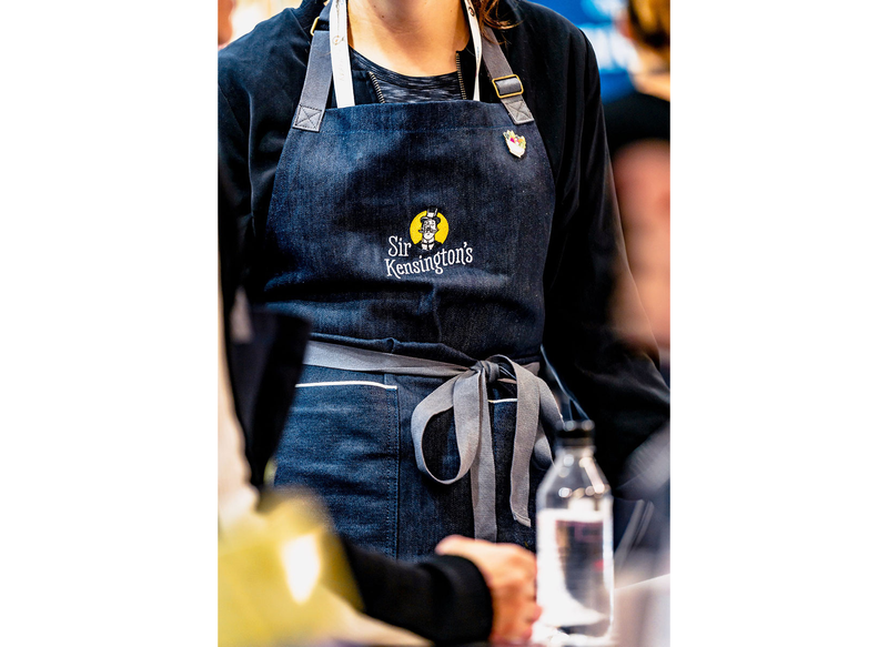
The Sir Kensington’s identity in use
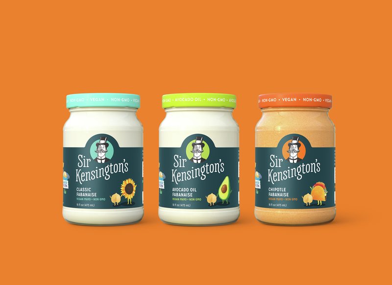
The Sir Kensington’s identity in use
Further reading
Our new look (Sir Kensington’s)
Sir Kensington’s redesign elevates the brand to the next level (The Dieline)