A custom typeface made entirely from scratch is the ultimate ownable design asset. But sometimes a simpler solution can provide similar benefits: modifying an existing typeface to meet specific needs. Customized fonts are a relatively quick and inexpensive way to fine-tune your aesthetic, similar to tailoring an off-the-rack garment rather than creating one from whole cloth.
Custom-tailored fonts
We’re happy to customize any of our typefaces to:
match your logo or concept
redesign individual glyphs for ownability
adjust proportions for your unique use case
add new styles or language support
To show the range of size for these projects, here are a few examples of how we’ve customized our chameleonic typeface Escalator for different clients, transforming its aesthetic and functionality through changes big and small.
Refitting Escalator to a client concept
A brand consultancy brought us a curvaceous logo they had created, with the hopes of expanding it into a fully-functioning typeface. Taking into account the limitations of their timeline and budget, we proposed instead adapting our typeface Escalator to match the logo.
Building on Escalator’s existing weight range and extensive character set, we incorporated their logo’s signature curves and adjusted other glyphs to harmonize with them. We also added a playful new outlined style and OpenType features for alternate glyphs. This allowed us to quickly produce a proprietary customized typeface that does exactly what they need it to do.
Technical tailoring for Goody
The online gifting service Goody wanted Escalator, but they wanted it their way. We meticulously fine-tuned the fonts for their specific usage, including increasing the x-height, changing some glyph widths, and tightening the letter fitting.
In a collaborative process, chief technology officer Mark Bao beta-tested the new “Goody Sans” on the live website and provided his own sketches for distinctive quotation marks. The resulting variable font, with an optical size axis, gives Goody granular control over its user’s experience, in an exclusive typographic voice.
Adding italics for Uncommon Goods
In a more straightforward project, we added additional font styles to Escalator for Uncommon Goods, an online retailer specializing in personalized gifts. Rachel Matts, design director at the creative agency Madwell, directed a complete redesign using our typeface, from the company’s logo to the product descriptions in their catalogs.
Their complex typesetting relies heavily on italic styles, so we fast-tracked some weights we hadn’t made yet for the in-progress family. The customized “UG Escalator” also includes a few tweaks to the frequently-used dollar sign and ampersand.
Subtle nuance for SCBWI
When Ben Loiz developed new branding for the Society of Children’s Book Writers and Illustrators, he felt that Escalator was a perfect fit—except for the curved tail of the lowercase y. Since that frequently-repeated letter appears prominently in the organization’s name, we swapped in the alternate straight y as default and dubbed the new fonts “SCBWI Escalator.” Simplifying this one small detail was fitting for the organization’s sharp new design system.
Script expansions at the ready
We’re working on a Cyrillic script expansion for Escalator, and we’re dipping our toes into additional writing systems for some other families. We enjoy tackling the complex challenge of expanding an existing typeface’s conceptual system within the constraints and cultural references of a different writing system.

What can we customize for you?
If you’re dreaming up a custom typeface, we'll be happy to meet you wherever you are in the project. Please get in touch so we can discuss the range of solutions we can provide.
Detail from the Uncommon Goods catalog
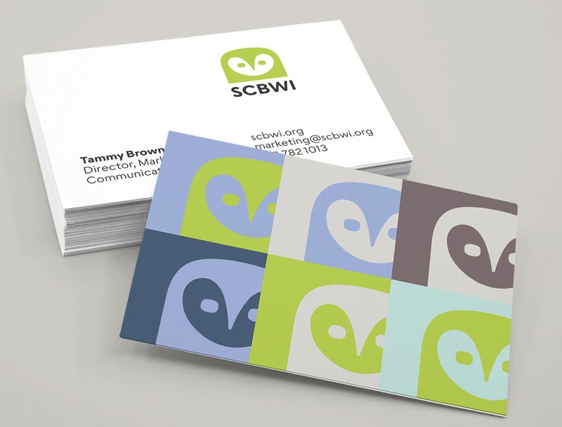
SCBWI design system
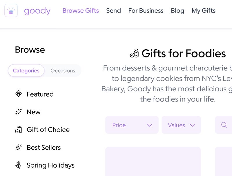
Goody’s website
Our mock-up of how the curvy customized Escalator could be used (still under NDA!)
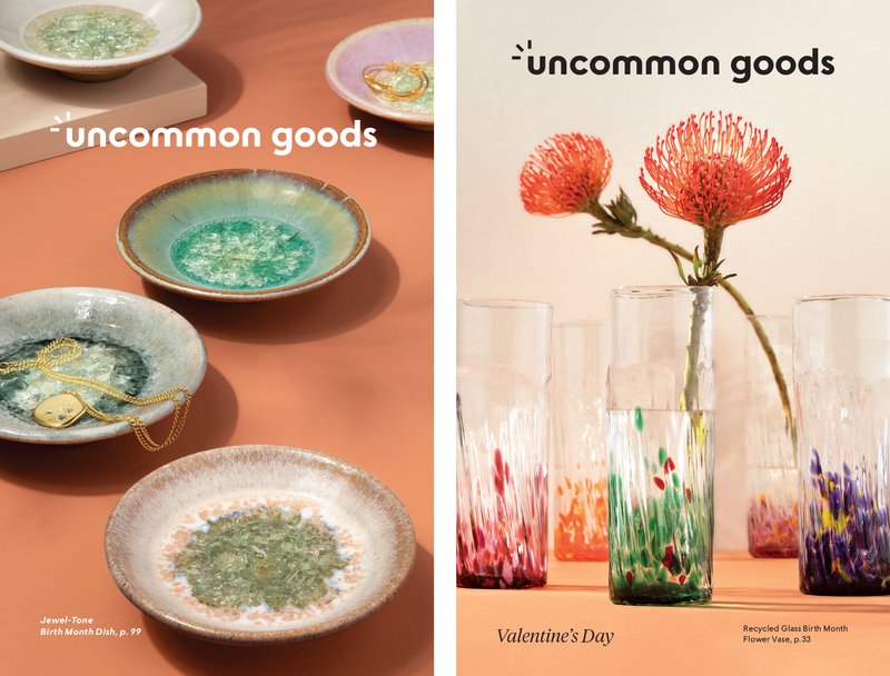
Two editions of the Uncommon Goods print catalog
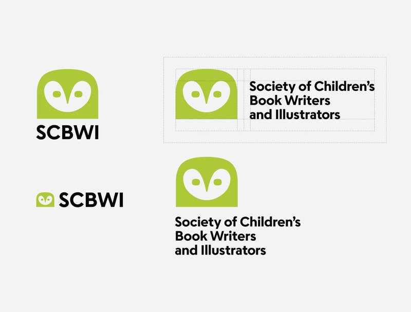
SCBWI design system
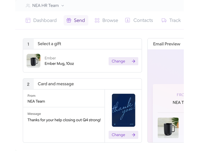
Goody’s user interface