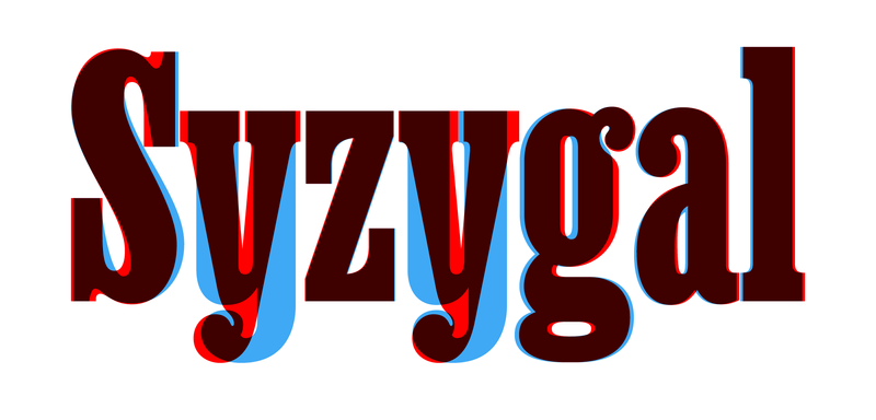
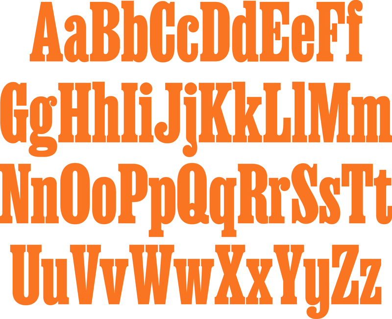
One of our favorite clients, Champions Design, contacted us after seeing Ben Kiel’s custom typeface for New York debut in the magazine’s 50th anniversary issue. The typeface we now know as Ballast, an extra-condensed spin on the historical typeface Egyptienne, perfectly fit Supermajority, a new political organization promoting women’s equality.
Fortunately, although the typeface was originally made for New York, it wasn’t exclusive to them. So we sent it along for testing, and the Supermajority identity began to come into focus. But Champions astutely identified a few small changes that would really make it sing.
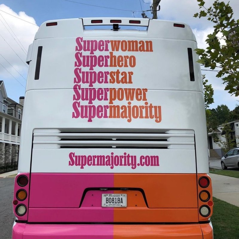
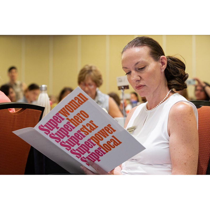
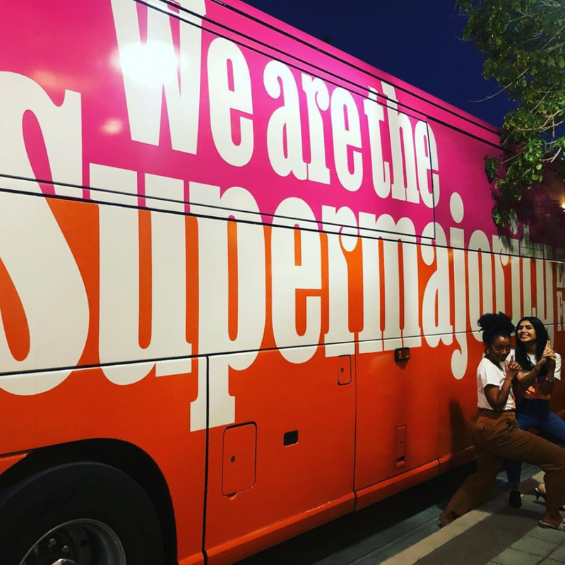
In the word “Supermajority,” two lowercase r’s, a j, and a y created distracting visual gaps, making the word feel inharmonious. Ben modified these letterforms to elegantly eliminate some of that space by pushing the ball terminals into the stems and giving the y a u shape that balances the typographic color and visual presence of the logotype.
Ben incorporated additional small changes based on the specific letter combinations, such as making the S serif align with the lowercase u to reinforce the density of the word.
From the beginning, we knew that Supermajority needed a full working font, not just a logotype. Customizing an existing typeface—Ballast—was an inexpensive solution for a unique brand typeface in a quick turnaround.
Taking cues from the logotype refinements, Ben worked his way through the character set, making letterforms more compact, shortening descenders, and tightening the overall fit. Although Ballast is available to anyone, the special version—with the distinctive S and y Champions requested—will be used exclusively by Supermajority.
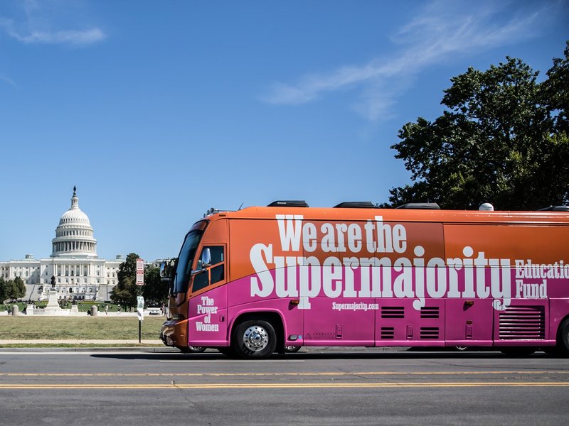
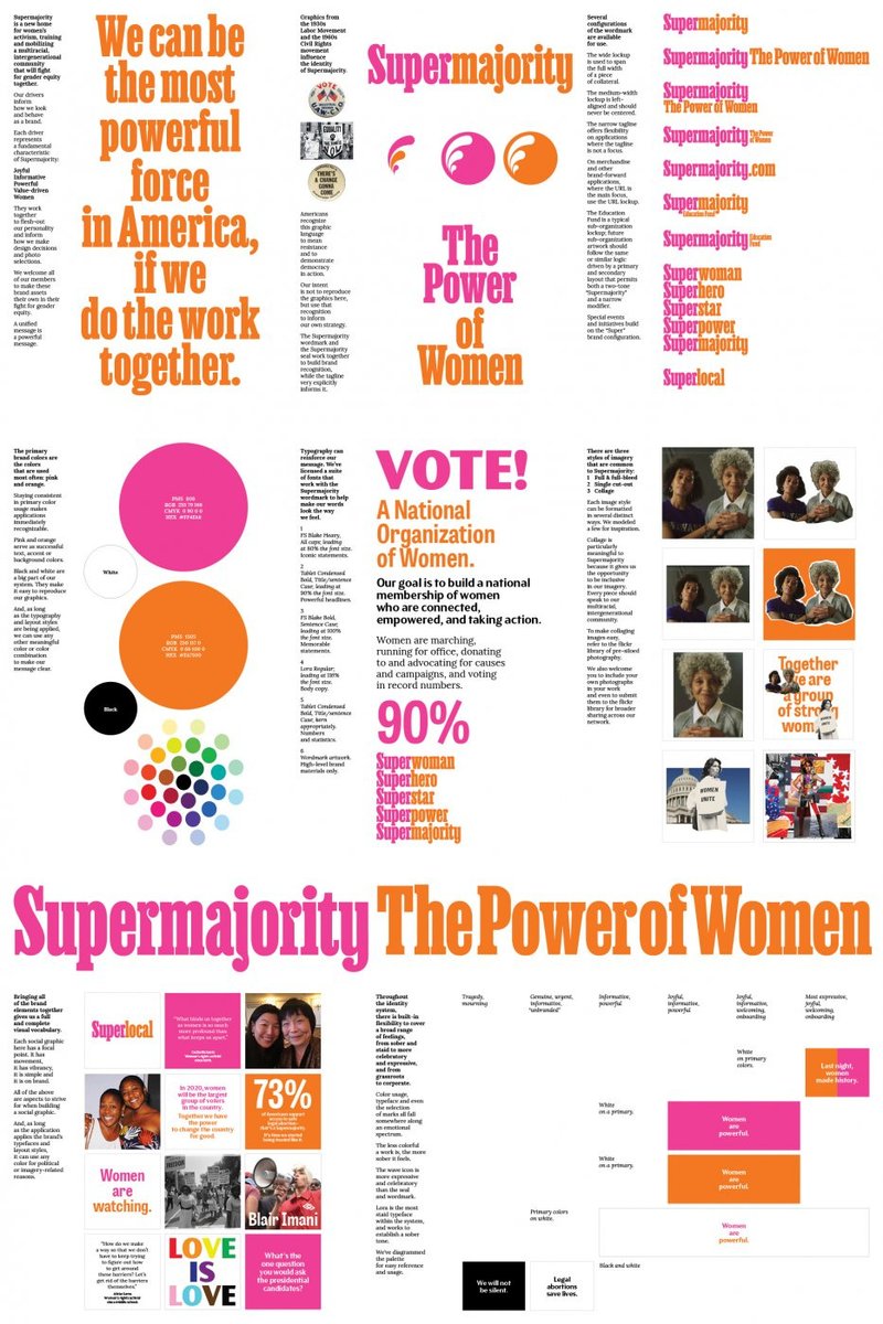
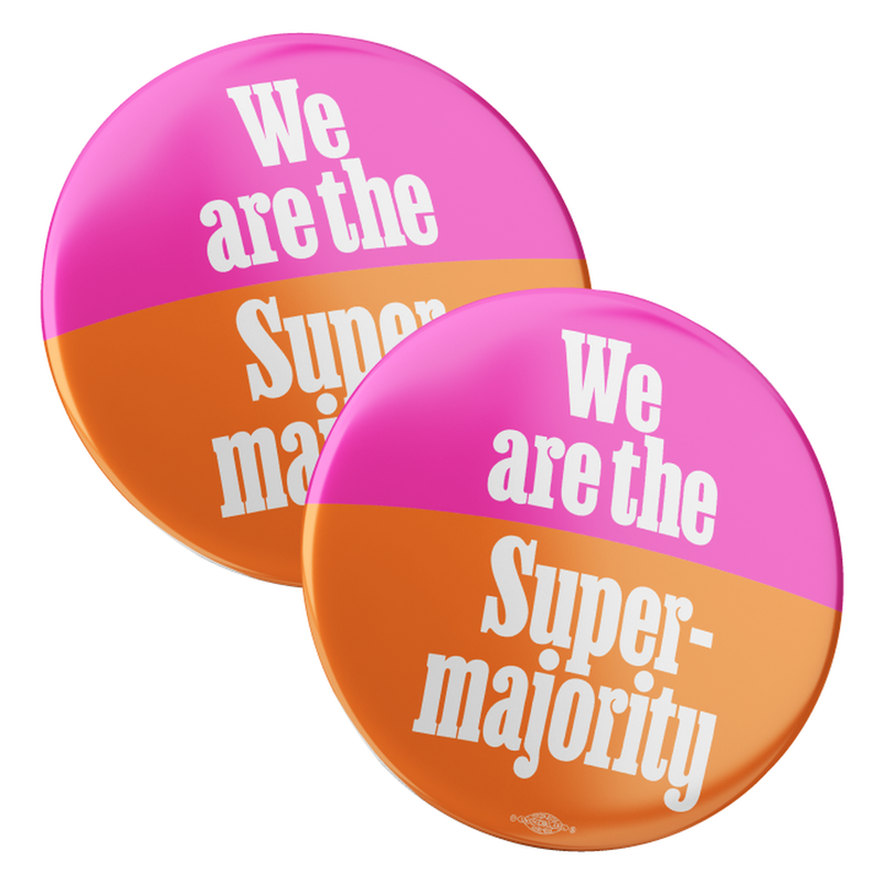
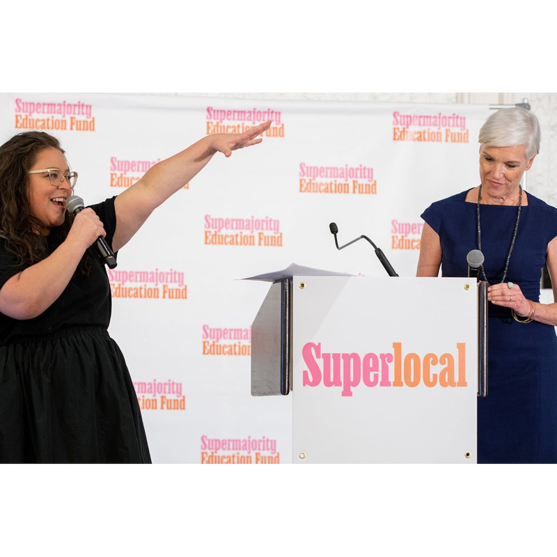
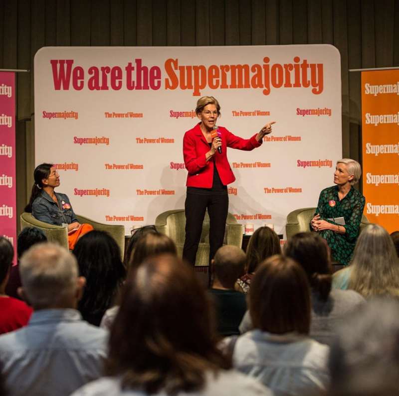
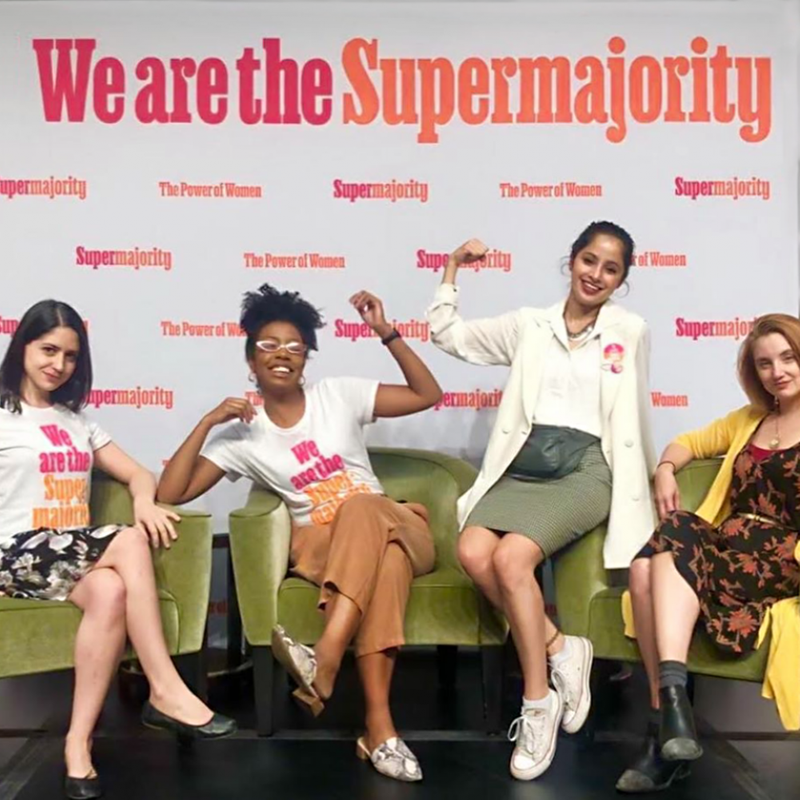
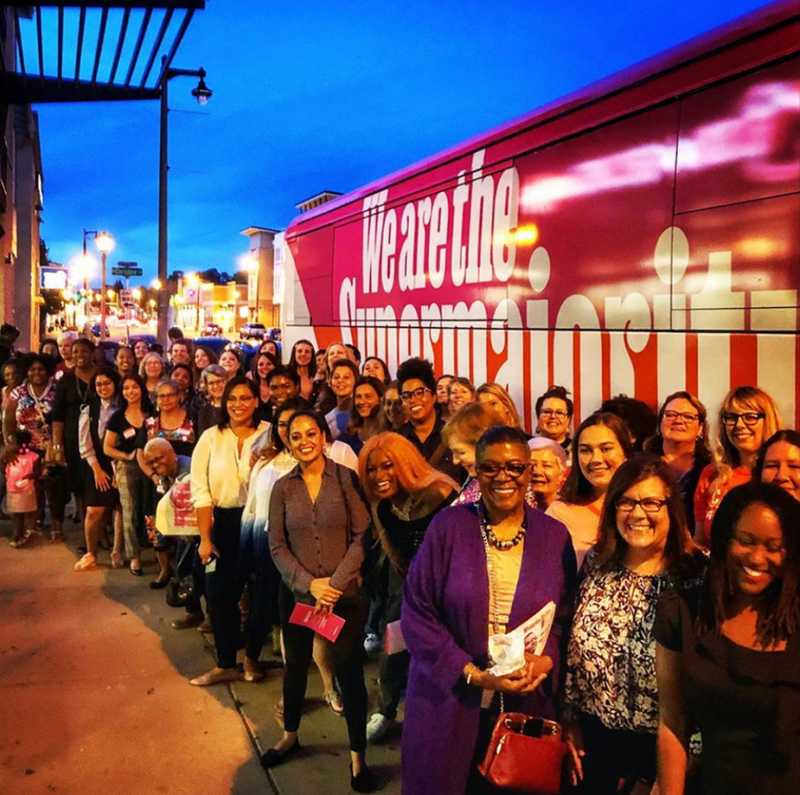
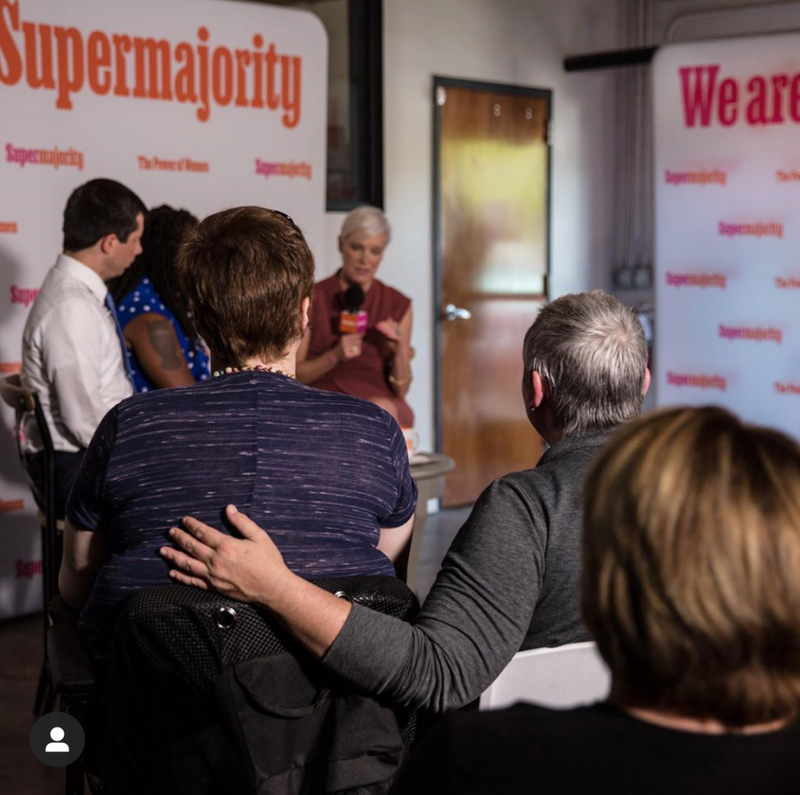
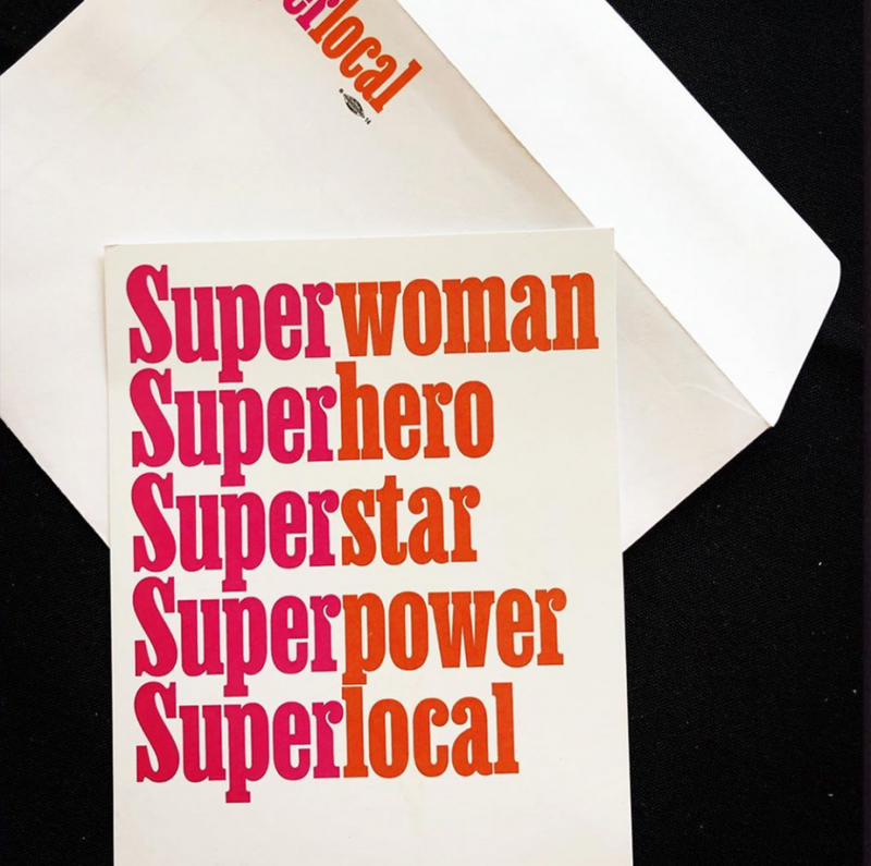
Champions Design’s bold and distinctive identity system hinged on custom-tailored type, setting Supermajority apart from other political organizations. The typeface took center stage on everything from a giant bus to small stickers handed out at events.
When customers show interest in fonts we haven’t finished yet, this often spurs us to further develop and complete our ideas (read more about this in our article “Fonts in progress”). Champions Design’s invaluable feedback provided a visual hook to Ballast, a typeface in search of a voice.
With newfound momentum, Ben continued evolving Ballast’s concept, exaggerating the ball terminals and carving out as much space as he possibly could to allow tight, dense typesetting. A partnership with Future Fonts to distribute the working version provided the perfect opportunity to get the font out into the world.
The typeface is still in progress, but you can license the current version of Ballast and get updates as development continues.